Answer the question
In order to leave comments, you need to log in
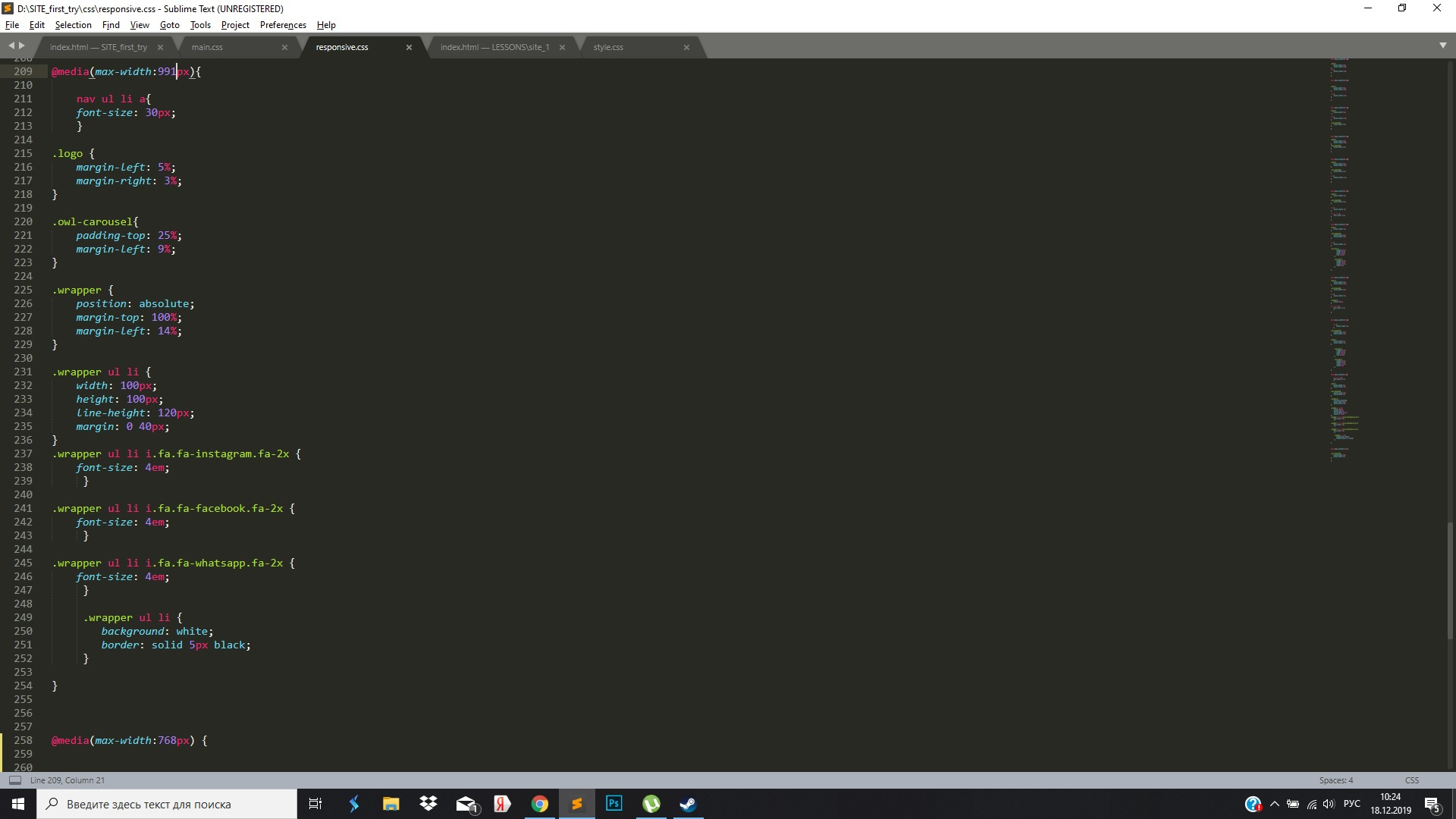
How to set values for max-width 768 and less with adaptive layout (it doesn't work for me for some reason)?
I am making my first site, so please do not swear strongly for the curvature and primitivism.
The bottom line is that after the values for max-width 991 for all other resolutions, the changes do not work. But if I copy the lines for, for example, max-width 768 before max-width 991, then everything works fine. Where am I dumb?
Answer the question
In order to leave comments, you need to log in
With max-width from larger to smaller :
@media (max-width: 992px) {...}
@media (max-width: 768px) {...}@media (min-width: 768px) {...}
@media (min-width: 992px) {...}OldKelt , Good afternoon.
Often
<meta name="viewport" content="width=device-width, initial-scale=1">@media screen and (min-width: 320px) and (max-width: 768px) {
}Didn't find what you were looking for?
Ask your questionAsk a Question
731 491 924 answers to any question