Answer the question
In order to leave comments, you need to log in
How to set up a modular grid?
Hello. I have a question, it is very simple: what kind of grid should be and can it be configured as I want?
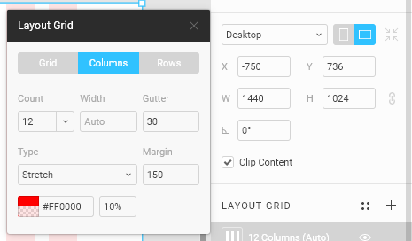
One person saw that he had the following settings:

Answer the question
In order to leave comments, you need to log in
Let's take a look briefly, but in detail:
1. The grid can be configured in a way that is convenient for you and the layout designer. Look at your ideas, if you want the site to be displayed in one way on FullHD monitors (1080p), and in another way on laptops - take into account the grid so that when adaptive you can reduce the number of columns and at the same time the elements have adaptive logic.
2. The Stretch parameter in the grid says that all elements will always be adaptive in width, and whatever the size of the layout, the elements will adjust to the size, and the margin parameter is responsible for the margin on the sides, which also flies at the discretion of the designer. Example:
This approach is always used in mobile applications, because there is no standard for phone screen size, each model differs in scale, and often because of this, applications look beautiful only on one screen, under which the layout was made. The Stretch parameter eliminates this error.
3. If you use the Center option, it's easier for you to get ahead of the content area, which will always be fixed. For example, for the bootstrap grid, the size of the content area is 1170px, and on laptops and computers, the site looks the same, the only thing that changes is the indentation on the sides.
Found a good article on grids for you: https://medium.com/@FigmaTips/%D1%81%D0%B5%D1%82%D...
Didn't find what you were looking for?
Ask your questionAsk a Question
731 491 924 answers to any question