Answer the question
In order to leave comments, you need to log in
How to render these columns with bootstrap or regular css?
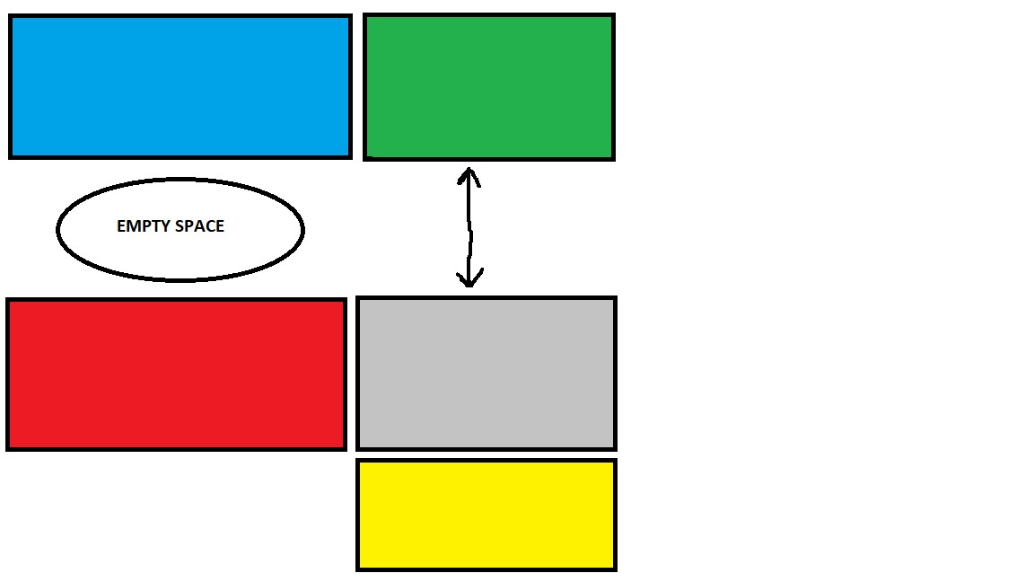
https://imgur.com/a/v7W8B
There is a green block that represents a clickable expandable list. Works via ajax. When it opens on the left, it just creates a free space between the red and blue block. Tell me how to make it so that the red block is always pressed to the bottom of the blue one? Thanks
Answer the question
In order to leave comments, you need to log in
For example like this:
.blue, .red, .green, .grey, .yellow {height: 150px;}
    .blue {background: blue;}
    .red {background: red;}
    .green {background: green; height: 300px;}
    .grey {background: grey;}
.yellow {background: yellow;}<div class="container-fluid">
<div class="row">
<div class="col-sm-8">
<div class="row">
<div class="col-sm-12 blue">синий блок</div>
<div class="clearfix"></div>
<div class="col-sm-12 red">красный блок</div>
</div>
</div>
<div class="col-sm-4">
<div class="col-sm-12 green">зеленый блок</div>
<div class="clearfix"></div>
<div class="col-sm-12 grey">серый блок</div>
<div class="clearfix"></div>
<div class="col-sm-12 yellow">желтый блок</div>
</div>
</div>
</div>Make two columns: in the left column there will be red and blue blocks, on the right - all the rest. Then, when stretched, the green block will not affect the left column. Now you have typed in lines, so the green block expands its line, but you need to lay it out in columns.
Didn't find what you were looking for?
Ask your questionAsk a Question
731 491 924 answers to any question