Answer the question
In order to leave comments, you need to log in
How to reduce cart abandonment?
I would just like to hear an independent opinion! Tips & Tricks
Better with numbers and sample cases.
Since, most likely, the eye has already blurred and a fresh look is needed.
The problem is the following, revealed a large number of cart abandonments at the very last moment (Adding goods to the cart - viewing the cart - placing an order (and then a person comes out)
It all came down to the fact that we a lot of items to fill out 
I would like to just foresee all possible shortcomings at once!
What else can influence cart abandonment besides a large order form
?
Answer the question
In order to leave comments, you need to log in
1. We throw out all optional fields.
2. Prefill city/region using https://sypexgeo.net/ (use the local version)
3. Full name, phone, mail can be pulled from vk using clickjacking if the user is authorized
https://github.com/romkagolovadvayha/romkagolovadv ... (only LIKE_ID generate different for different users and remember it on the client)
4. Reduce the distance between the fields - the form seems larger than it actually is.
5. If the user has already entered this data at least somewhere on your site, then do not force him to enter it again.
Read the report of the joint study by MasterCard and UsabilityLab on the usability of the online shopping process:
newsroom.mastercard.com/en/files/2015/06/MasterCar...
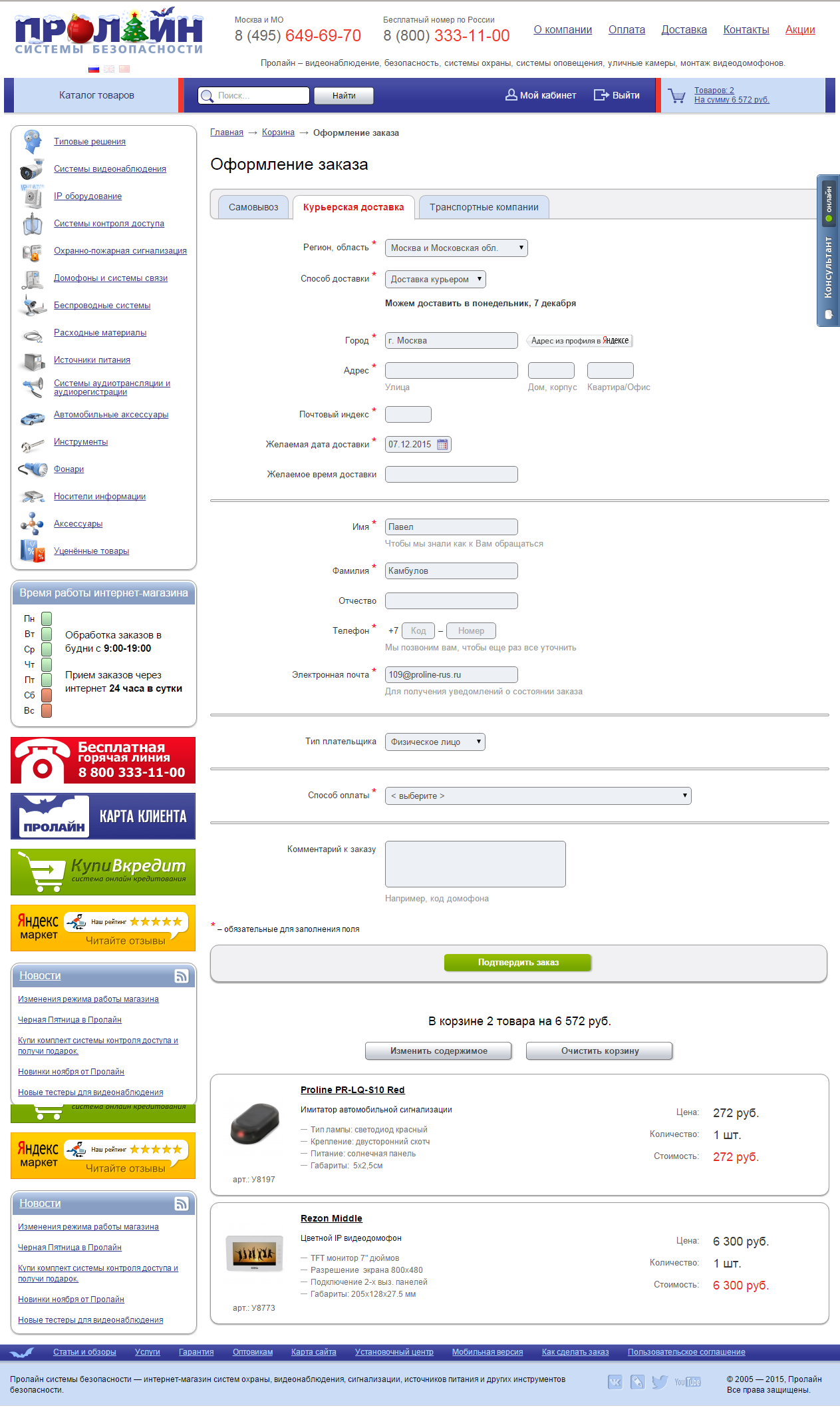
The screenshot shows the following shortcomings:
Yes, indeed, the first impression is that I really want to leave.
Sadness immediately evokes: if I want to go through this entire quest to the end, then it is very tiring ....
Some bookmarks, a million fields, the length of the form is 3 screens ... - I don’t like it.
Didn't find what you were looking for?
Ask your questionAsk a Question
731 491 924 answers to any question