Answer the question
In order to leave comments, you need to log in
How to properly think of a template?

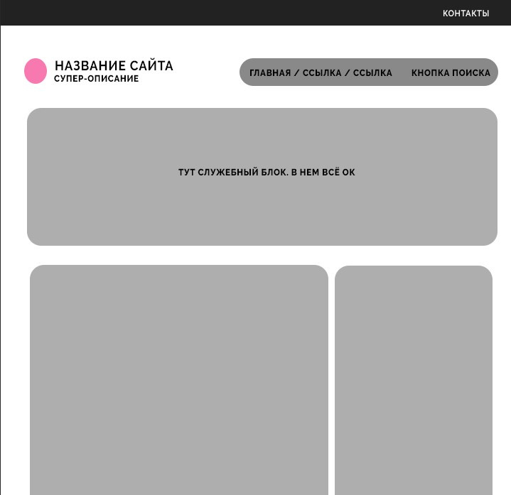
Hello! I have something like this site structure.
But I don't like the top strip with the "Contacts" item, I don't know how to change it, what to put in it. There is a menu, links to social networks. There are networks, there is a subscription form.
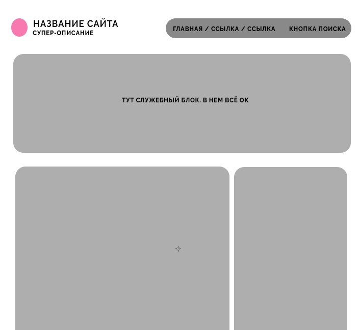
And the fact is that when I remove this upper black bar, the site looks miserable both from a computer and from a phone. For there is some effect of emptiness "up" like this:  Question:
What to do with this upper strip? What to put in it at all? I definitely don’t want to clean it up, because my perfectionism will not accept it. Maybe there is an option to completely redo the site header?
Answer the question
In order to leave comments, you need to log in
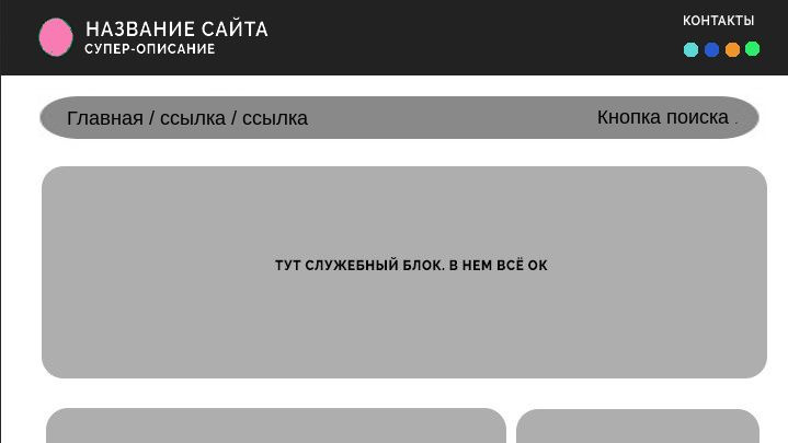
Maybe rearrange the logo to a dark stripe, and stretch the menu to full width?
and in the style of modern landing pages?
so that the main screen on the whole vw and vh and the menu (gray bar) at the very top from the right
and under the main screen is everything else .. the
gray bar (menu) sticks when scrolling and so on
Time, exchange rate, weather, social network icons, personal account (if any). All this can be crammed into the top die.
Didn't find what you were looking for?
Ask your questionAsk a Question
731 491 924 answers to any question