Answer the question
In order to leave comments, you need to log in
How to position a fixed element so that it doesn't move away when the screen size is reduced?
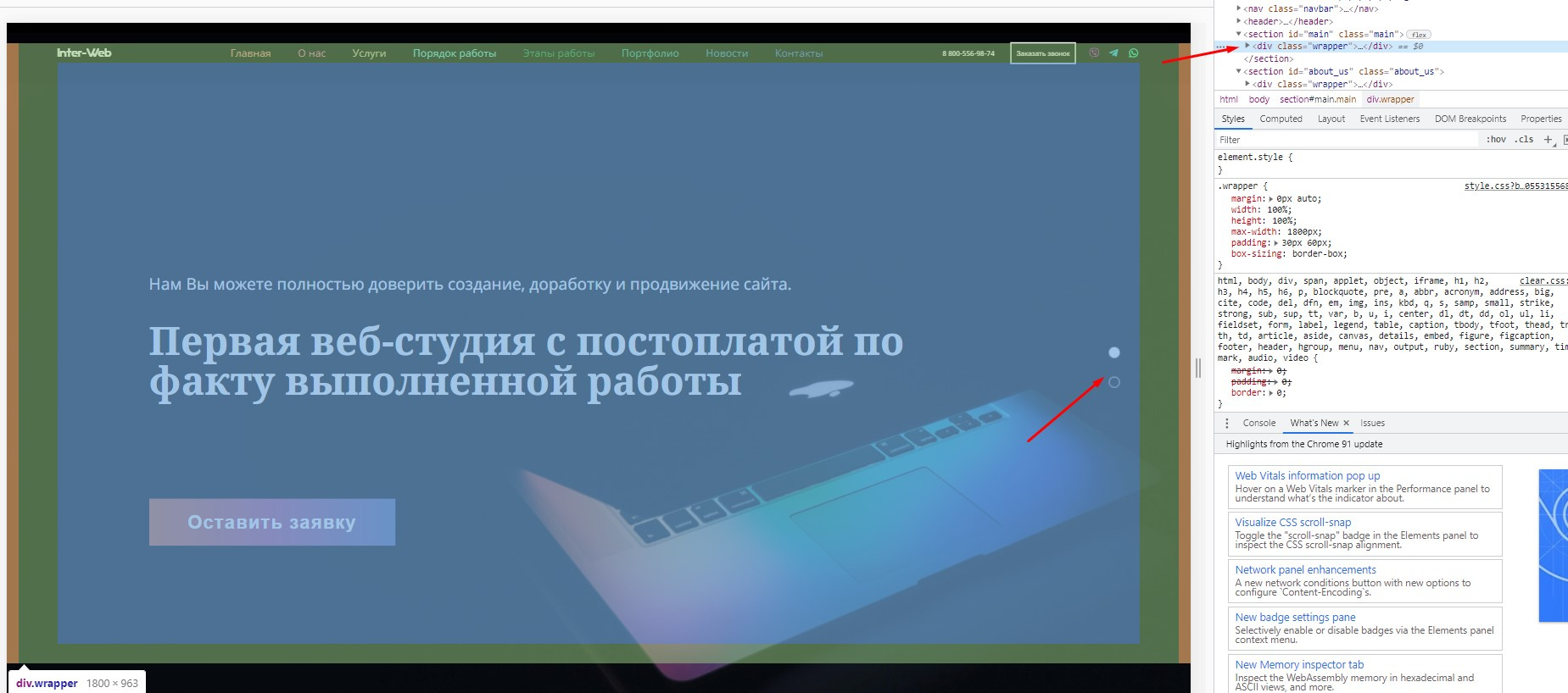
I have a vertical navigation menu .navbar in the form of white circles. How can I make this block fit to the edge of the .wrapper (or at least stay on the edge) and not go anywhere when the screen is reduced, despite the fact that it has the position: fixed property? Or is the only way out is to move it approximately to the edge of the .wrapper each time through media queries?
All code https://jsfiddle.net/dut2v5ws/
The site itself is ilyin1ib.beget.tech
<nav class="navbar">
            <ul>
                <li>
                    <a href="#main" class="dot active" data-scroll="main">
                        <span>Главная</span>
                    </a>
                </li>
                <li>
                    <a href="#about_us" class="dot" data-scroll="about_us">
                        <span>О нас</span>
                    </a>
                </li>
            </ul>
        </nav>
.navbar {
position: fixed;
top: 50%;
right: 110px;
transform: translateY(-50%);
z-index: 1000;
}
Answer the question
In order to leave comments, you need to log in
Instead of right: 110px, specify the position as a percentage or 5vw, for example.
Didn't find what you were looking for?
Ask your questionAsk a Question
731 491 924 answers to any question