Answer the question
In order to leave comments, you need to log in
How to make the same navbar?
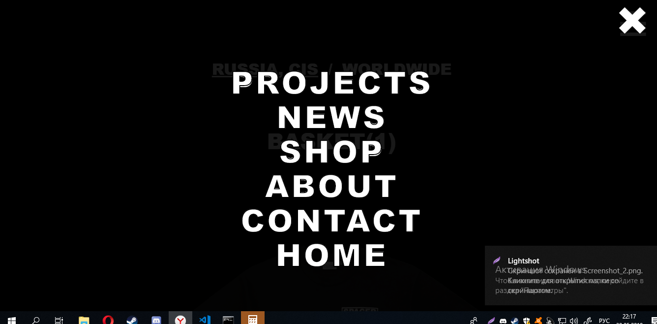
Good evening everyone! I wonder how to do the same as in the picture, what is used for this and how to implement it. In general, it is similar to Bootstrap, but there is a little different. (When I bring the screen closer, that is, the tablet / phone changes the menu).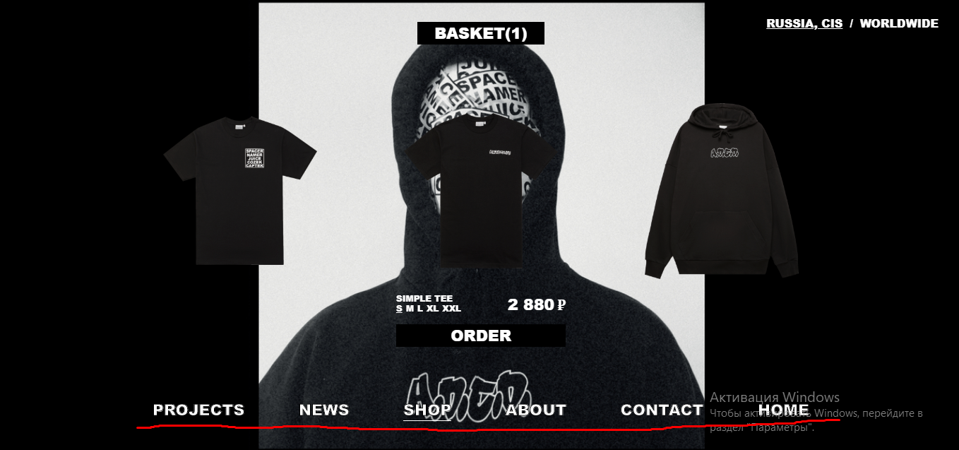
Answer the question
In order to leave comments, you need to log in
I didn't understand the difficulty.
<div class="main">
    <div class="wrap">
        <div class="block">Projects</div>
        <div class="block">News</div>
        <div class="block">Shop</div>
        <div class="block">About</div>
        <div class="block">Contact</div>
        <div class="block">Home</div>
    </div>
  </div>
.block {
margin-bottom: 10px;
}
.block:last-child {
margin-bottom: 0;
}
@media (min-width: 768px) {
.main {
display: flex;
justify-content: center;
}
.wrap {
display: flex;
}
.block {
margin-right: 10px;
}
.block:last-child {
margin-right: 0;
}
}Didn't find what you were looking for?
Ask your questionAsk a Question
731 491 924 answers to any question