Answer the question
In order to leave comments, you need to log in
How to make a layout correctly?
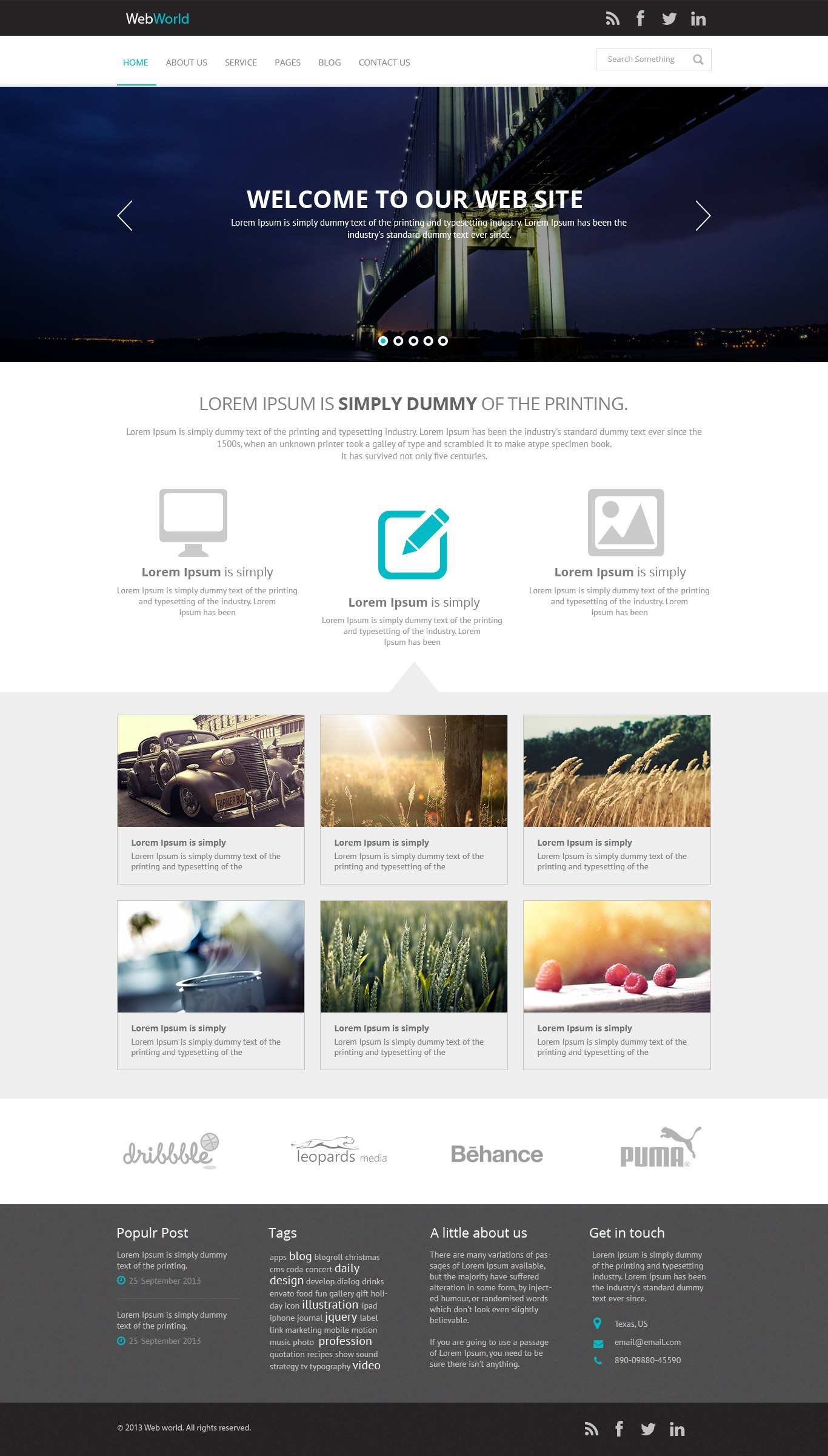
I comprehend the basics of layout. I chose an uncomplicated layout for training.
The layout width is 1366px. The width of the main content is 980px.
Confuses only the slider - the entire width of the layout.
How to properly layout for large screens (1920px): stretch the layout and slider to full screen, and the main content to the width of the container in the bootstrap 1170px or leave the width that is in the layout for wide screens?
Answer the question
In order to leave comments, you need to log in
In general, look) Imagine you work for Company "A" and a customer comes to it and decides to make a website. He and the manager go to the designer and the most terrible things for you are solved there. In general, they made a layout and sent it to you... And they say we want everything as it is in the layout... And here is a question for you, will you do it as in the layout, or will you invent your own width of the container? (Personally, I tried to do it 3-5 times as it is better for the site and took the width as a basis myself ...... But here I get complaints, formidable letters that everything is wrong .... the width is more or less than necessary, everything looks different ...... In general, hemorrhoids are higher than the roof.)
So we figured out the width ...... let's move on ....
So we have a slider at 100% width ....... in what's the problem take bx-slider and set your slider to 100%
And so for you, the most important thing is to decide how you will make blocks) for example
1) The most terrible block for you will probably be this one with a gray background ..... with a triangle top. Question on means css or a picture? (correct with css borders and pseudo classes)
2) How will you position the blocks? float or position . (Here you need to think about the future, if you remake it in responsive then float, if not, then you can position it, it’s not really scary.)
3) Learn html5 and use html5 tags where is the aside tag.... the rest are simpler).
4) Minimization and structure (
a) UTF-8 quote without BOM
b) Do not use styling classes to communicate with JS. but use id, data- attributes or classes with the prefix js-
c) Specify meta name="viewport"............
d) Skype plugin should not break the layout
e) A single css file included in head and preferably minimized
e) A single js file included before /body is also preferably minimized.)
5) Study methodologies Preferably BEM
6) Study Grunt or Gulp automation (Gulp is better)
7) Layout with Emmet (Save time)
This is pretty quick to master ...... Alas, no one told me so and did not write before)
In my opinion, this is more a matter of design than layout.
The layout looks like it's 100% wide, but with the slider it's really an issue.
If the image for it is actually 1920px wide - that is, it's centered and everything that doesn't fit on the screen is cut off...
...or the image is allowed to grow proportionally -
then yes, drag the block to 100% of the screen width.
If not, you can limit the width as it is in the layout (1366), but then you also need to think about reducing it for smaller screens.
The decision should be made by the one who is responsible for the visual component of the project, preferably in agreement with the customer. If you do for training you are here for everyone at once.
Didn't find what you were looking for?
Ask your questionAsk a Question
731 491 924 answers to any question