Answer the question
In order to leave comments, you need to log in
How to implement two fluid columns, one of which depends on the content of the second in width?
Hello, the following problem appeared, to which I could not find an answer, so I want to ask experienced people for advice.
There is a container for two blocks, the first of which is search block #1 and the second block is for icons #2.
it is necessary to make the layout with the expectation that if the number of icons is reduced or added in the second block, the first block would automatically adjust its width. 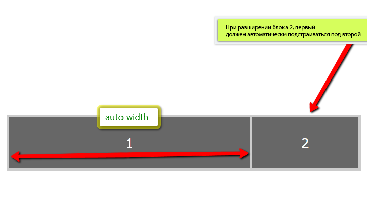
If anyone knows how this is implemented, please help with advice. If possible, a cross-browser solution is desirable.
Thanks in advance
Answer the question
In order to leave comments, you need to log in
Here is an example
Try adding icons to see the result
Didn't find what you were looking for?
Ask your questionAsk a Question
731 491 924 answers to any question