Answer the question
In order to leave comments, you need to log in
How to implement the effect "rotate your device for a more comfortable display of the site" in portrait view from mobile devices?
Hello everyone) thank you very much decided to take the time to my question! :)
I'm very new to web dev :)
The problem is the following:
I want to implement the effect "rotate your device for a more comfortable display of the site" so that a certain backgroud img/rotate.jpg is loaded on mobile devices in portrait mode and that it is beautifully displayed.
That's how it doesn't work 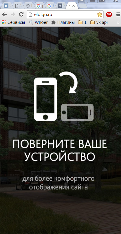
, so I don't try, I either have a white screen in portrait view or the fear of God))))
That's the only thing that can be realized.
custom css
/* 19 rotate
----------------------------------------------------------------------------- */
@media only screen and (max-width: 519px) and (orientation: portrait) {
  body {
    display: none;
  }

  html:after {
    position: absolute;
    left: 0;
    bottom: 0;
    right: 0;
    color: #000;
    text-align: center;
    padding: 5%;
    top: 50%;
    font-family: Open Sans, sans-serif;
    font-size: 16px;
    content: 'поверните Ваше устройство для более комфортного отображения сайта';
}Answer the question
In order to leave comments, you need to log in
For those who are bad with JS javascript
, you need to create custom css in slyles.css
/* 19 Rotate
----------------------------------------------------------------------------- */
@media only screen and (max-width: 600px) and (orientation: portrait) {

  body {
    display: none;
    background: url(../img/rotate.jpg);
    background-repeat: no-repeat;
    background-position: center center;
    background-size: cover;
    -webkit-background-size: cover;
background-attachment: fixed;The script is very easy to do:
if(document.all){
        var width = document.body.clientWidth;
        var height = document.body.clientHeight;
    }else{
        var width = innerWidth;
        var height = innerHeight;
    }

    if(width>height){
        alert('Альбомная');
        $('.error_orientation').show();
    }else{
        alert('Портретная');
}Didn't find what you were looking for?
Ask your questionAsk a Question
731 491 924 answers to any question