Answer the question
In order to leave comments, you need to log in
How to explain to the designer how to use the grid or the fool himself?
Good evening, dear designers.
Please tell me how to explain to the designer how to use the grid. Or poke me with your finger where to read about indents, etc.
The essence of the problem: 
Our layouts are usually drawn at 320, 768, 1024, 1280 and 1440+
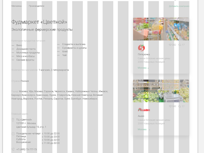
Here the Artboard is 1280 pixels, and the content area is 1170 pixels. Although it should be 1280.
So I read that they either put on the sides a column for indents, or they do them inside the columns.
Is it so?
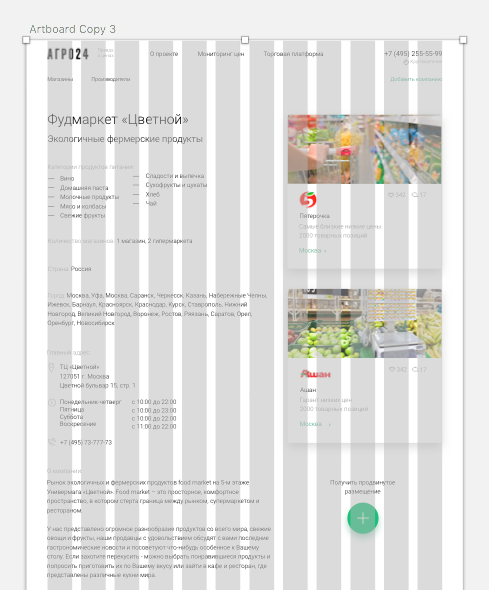
There is also such an option: 
here the artboard is 1134 and the content area is 1024 (as it should be). But again, there are no indents?
Maybe I don't understand something? Explain, please
Answer the question
In order to leave comments, you need to log in
How to explain to a designer how to use a grid
Indents for the content area are needed, but of course it depends on the type of content (text, picture, banner, etc.). A block with a menu, for example, needs padding inside the block. It is better to immediately take into account the indents so that on mobile content does not stick to the edge of the screen.
It's best to explain clearly
Didn't find what you were looking for?
Ask your questionAsk a Question
731 491 924 answers to any question