Answer the question
In order to leave comments, you need to log in
How to display content at 100% screen width?
Good day to all. I am learning to make websites. But I ran into a problem that my site is not displayed on devices at 100% width and white space appears on the right. Yes, since my content part is maxed out at 1440px. But, on small devices, when scaling the same problem. 1) How to fill 100% width on small devices using media queries (or something else)? 2) How on large devices, either take 100% width or 1440px content take a position in the middle of the screen?
How it looks on TV: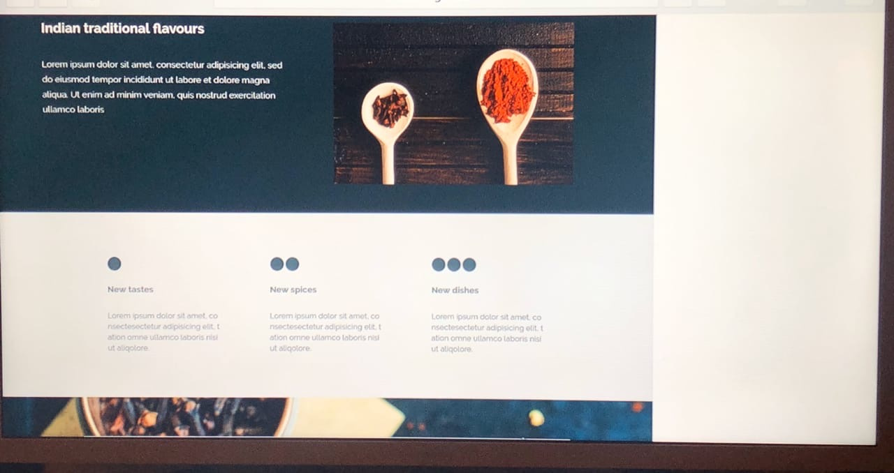
And the site template itself, which I actually wrote from scratch according to the layout:
https://yadi.sk/d/WhOROmJyQeoSbw (rar file)
Who doesn’t like rar here is a link to index.html and style.css:
https ://yadi.sk/d/oiQ0EIdcE4q_3Q
or:
https://codepen.io/Ozerovwebmaster496/pen/ExaOEpJ?...
And in general, in addition to the main questions, I ask you to look at the template and perhaps give any recommendations that are not yet on the topic of the question.
Answer the question
In order to leave comments, you need to log in
The main advice has already been given above. And also this layout does not pass by the current standards of an "adaptive" site, so I will add links to topics that should be studied as a novice layout designer / front-end developer:
1. Basics of responsive (adaptive) design [Google Developers]
2. Media queries [MDN]
3. Basic about the concepts of adaptive, responsive and res... [VYSOKOFF Blog]
Didn't find what you were looking for?
Ask your questionAsk a Question
731 491 924 answers to any question