Answer the question
In order to leave comments, you need to log in
How to disable 'hamburger' menu icon from wrapping to next line when image is scaled down in bootstrap?
Good day!
When the screen resolution is reduced, the icon moves to the next level, but I would like it to remain in one line and compress the logo image. The image is compressed - everything is ok.
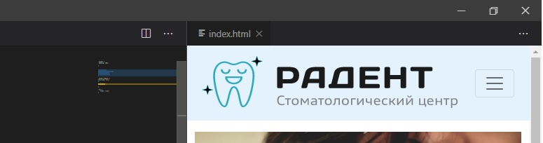


Image options in CSS:
.LogoImage {
display: inline-block;
max-width: 100%
max-height: auto;
}
Thanks in advance!
Answer the question
In order to leave comments, you need to log in
Hey!
You can make the following structure:
HTML
<div class="area">
    <div class="area-img">
        <img class="LogoImage" src="/img.png"> <!-- твой логотип -->
    </div>
    <div class="area-menu">
        <button></button> <!-- твоя кнопка меню -->
    </div>
</div>.area {
display: flex;
flex-wrap: nowrap;
}
.area-img,
.area-menu {
display: flex;
}
.LogoImage {
width: 100%;
height: auto;
}Didn't find what you were looking for?
Ask your questionAsk a Question
731 491 924 answers to any question