Answer the question
In order to leave comments, you need to log in
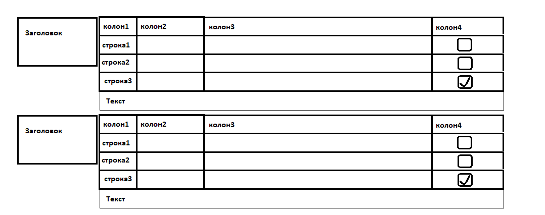
How to beat the UI / UX of such a prototype?

Until I started to implement it, and in order not to redo it, I decided to ask you.
There can be more than 1 such block. In each block, there is a "Header" and a table type.
For example, "line3", when you click on the line, namely the checkbox, the line-variant "line3" is selected and an additional info-block under the line is opened. If you select "line1" through the checkbox, then the info block will be displayed under it and will move the lines lower, like a slideDown. The content in the info block is different, from forms to text.
Tables always have sorting, but with an additional info block it will complicate everything and I want to avoid it.
How to beat ux, are there any principles, rules for building an interface for such a case?
Please share links if they exist. Thank you!
Answer the question
In order to leave comments, you need to log in
Still, it depends on the problem statement, i.e. if the prototype is yours and it can be corrected, then I would correct some points. And if the prototype is approved, and you need to draw the interface, then you don’t even have to talk about convenience :)
In essence: the headings on the left confuse me the most, but if the table is not very wide, and the headings are one word, then this is an option. If we are talking about the web, then on the tubes you still have to make headings above the table, so why pull?)
I don’t see any problems with the text under the table, the main thing is the styles: the text of the infoblock cannot be separated by a line (border) from the line, otherwise the belonging will be lost. For this reason, the table must be without vertical borders, otherwise it will be terrible. The text of the infoblock itself can be enclosed in some kind of "bubble", which will point to the line. And then everything will look decent even if there are 100 lines (you can still close the info block when opening another, but if they are large, the page will twitch).
In terms of interaction, the behavior of the checkbox is a bit illogical. As a rule, the user must first see a hint, and then make a choice. If this is not a test, then you can display the infoblock as a tooltip when hovering over the checkbox, and by clicking "spread" the line and leave the infoblock visible.
Advice could be more specific if there was an understanding of what kind of product, where it is used, by whom :)
Where is the UI/UX? Fucking uncomfortable crap.
So you are really asking how to do what a UI (User Interface - beauty) / UX (User experience - convenience / simplicity ) designer must be able to do?
How to beat ux, are there any principles, rules for building an interface for such a case?
Use the state and when something changes in it, everything is redrawn. An array will do just fine.
It would be nice to screw React (or another UI library) here to make it easier to interact with the DOM.
But you can write everything yourself :-)
Didn't find what you were looking for?
Ask your questionAsk a Question
731 491 924 answers to any question