Answer the question
In order to leave comments, you need to log in
How to align blocks in height when changing resolution?
I'm making a simple template.
The block code is as follows
<div class="features row doFollowrow">
<div class="col-xs-6 col-sm-4 icon-block icon-left">
<div class="icon"><i class="fa fa-television fa-2x"></i></div>
<div class="icon-block-description">
<h4>Responsive & Retina ready</h4>
<p>doFollow looks great on any device of your choice</p>
</div>
</div>
<div class="col-xs-6 col-sm-4 icon-block icon-left">
<div class="icon"><i class="fa fa-eyedropper fa-2x"></i></div>
<div class="icon-block-description">
<h4>Unlimited color options</h4>
<p>Change colors easily and give your landing page a new look in seconds</p>
</div>
</div>
<div class="col-xs-6 col-sm-4 icon-block icon-left">
<div class="icon"><i class="fa fa-shopping-cart fa-2x"></i></div>
<div class="icon-block-description"><h4>Made for conversion</h4><p>A layout that showcases your product with style</p>
</div>
</div>
<div class="col-xs-6 col-sm-4 icon-block icon-left">
<div class="icon"><i class="fa fa-line-chart fa-2x"></i></div>
<div class="icon-block-description">
<h4>SEO optimized</h4>
<p>Clean semantic code, content first, search engines will love your new project</p>
</div>
</div>
<div class="col-xs-6 col-sm-4 icon-block icon-left">
<div class="icon"><i class="fa fa-star-o fa-2x"></i></div>
<div class="icon-block-description">
<h4>580+ Font Icons</h4>
<p>doFollow uses the growing FontAwesome icon library with over 580 font icons at your disposal</p>
</div>
</div>
<div class="col-xs-6 col-sm-4 icon-block icon-left">
<div class="icon"><i class="fa fa-life-ring fa-2x"></i></div>
<div class="icon-block-description">
<h4>Outstanding Support</h4>
<p>Need help with the template? No problem, you can count on us 365 days a year</p>
</div>
</div>
</div>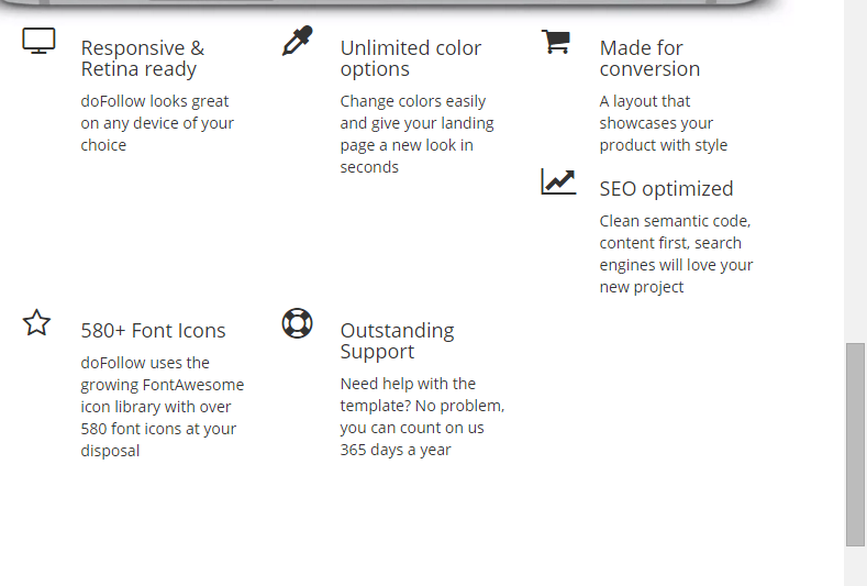
Answer the question
In order to leave comments, you need to log in
And yet, I'm smart.
After every second
div, col-xs had to be added for additional cleaning if they differ in height
You can interrupt the flow around each Nth block in this way:
.col-xs-6:nth-child(2n+3) {
   clrar: both;
} /*Для строки из двух элементов*/@mediasetting the parameters you need for the rest of the permissions, in my opinion this is much easier than prescribing<div class="clearfix visible-xs-block"></div>
Didn't find what you were looking for?
Ask your questionAsk a Question
731 491 924 answers to any question