Answer the question
In order to leave comments, you need to log in
How to adjust width responsively for different sizes?
Here are the pictures of the application page: 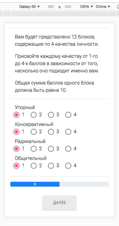
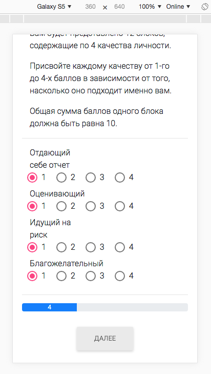
On the first picture, we want the result, on the second we see how the labels above the radio buttons go to the second line... Everything is fine on the big screen, the problem is with small devices
Here is the markup code, tell me how to fix it. I use bootstrap, little experience in layout...
<div class="container-fluid">
  <div class="row" *ngFor="let skill of skills">
    <div class="col-8">
      {{ skill.name }}
    </div>
    <mat-radio-group id="radioform" [(ngModel)]="skill.value" (change)="onChange()">
        <mat-radio-button class="mvv-radio"
          *ngFor="let item of [1, 2, 3, 4]" [value]="item"
          [disabled]="skill.available < item"
          [checked]="skill.available === 1 && item === 1"
          >
            {{ item }}
        </mat-radio-button>
    </mat-radio-group>
  </div>
</div>
<hr>
<div class="progress">
  <div class="progress-bar" [ngStyle]="{'width': progressValue}" >{{ count+1 }}</div>
</div>
<div class="text-center">
  <br>
  <button
  type="button"
  *ngIf="!isResult"
  mdbBtn color="light"
  mdbWavesEffect
  (click)="getNextFormBlock()"
  [disabled]="!isComplete">Далее</button>
  <button
  type="button"
  *ngIf="isResult"
  mdbBtn color="success"
  mdbWavesEffect
  (click)="getNextFormBlock()"
  [routerLink]="[ '/result-page' ]"
  [disabled]="!isComplete">Узнать результат</button>
</div>Answer the question
In order to leave comments, you need to log in
Didn't find what you were looking for?
Ask your questionAsk a Question
731 491 924 answers to any question