Answer the question
In order to leave comments, you need to log in
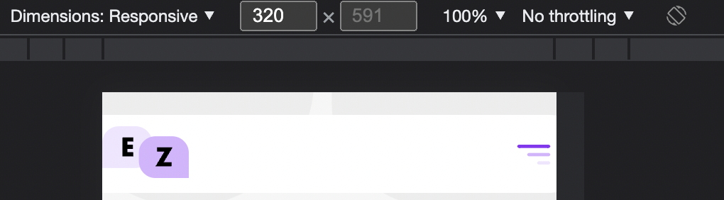
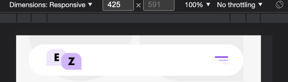
How to adapt to different mobile screen sizes in Tilda?
Hi! How to adapt to different mobile screen sizes in Tilda? In Tilda, it is possible to adapt the mobile version only to a size of 320 px wide, but how to make it adaptive to 425 px?
Answer the question
In order to leave comments, you need to log in
2 solutions:
1. Bind the position and size of the elements to the container and not the grid [elements on the left and right will be constantly at the same distance from the edge of the screen, the wide element will have a relative value, for example 90%]
2. Enable Autoscale [collected under a 320px layout will be proportionally stretched to fit any screen resolution]
Didn't find what you were looking for?
Ask your questionAsk a Question
731 491 924 answers to any question