Answer the question
In order to leave comments, you need to log in
How do I fix awkward interface changes in Adobe Photoshop CC 2015.1 after the November 30, 2015 update?
Artboards made it easier to work in Photoshop (especially for mobile app design)
The latest update of Photoshop CC 2015 brought a lot of changes to the interface as well as to the workspace. This also affected the brand new Artboards.
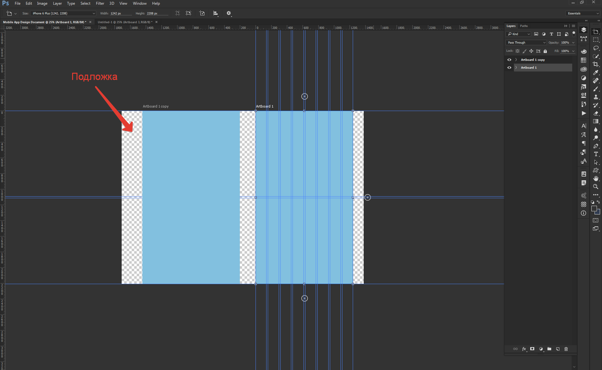
If in the previous version each sheet (Artboard) was, as it were, separate from each other, now there is a substrate that interferes. In my example, it is transparent. I dug into the settings, I didn’t find how to remove it, maybe someone knows the answer to this question?
Screenshots in the application:
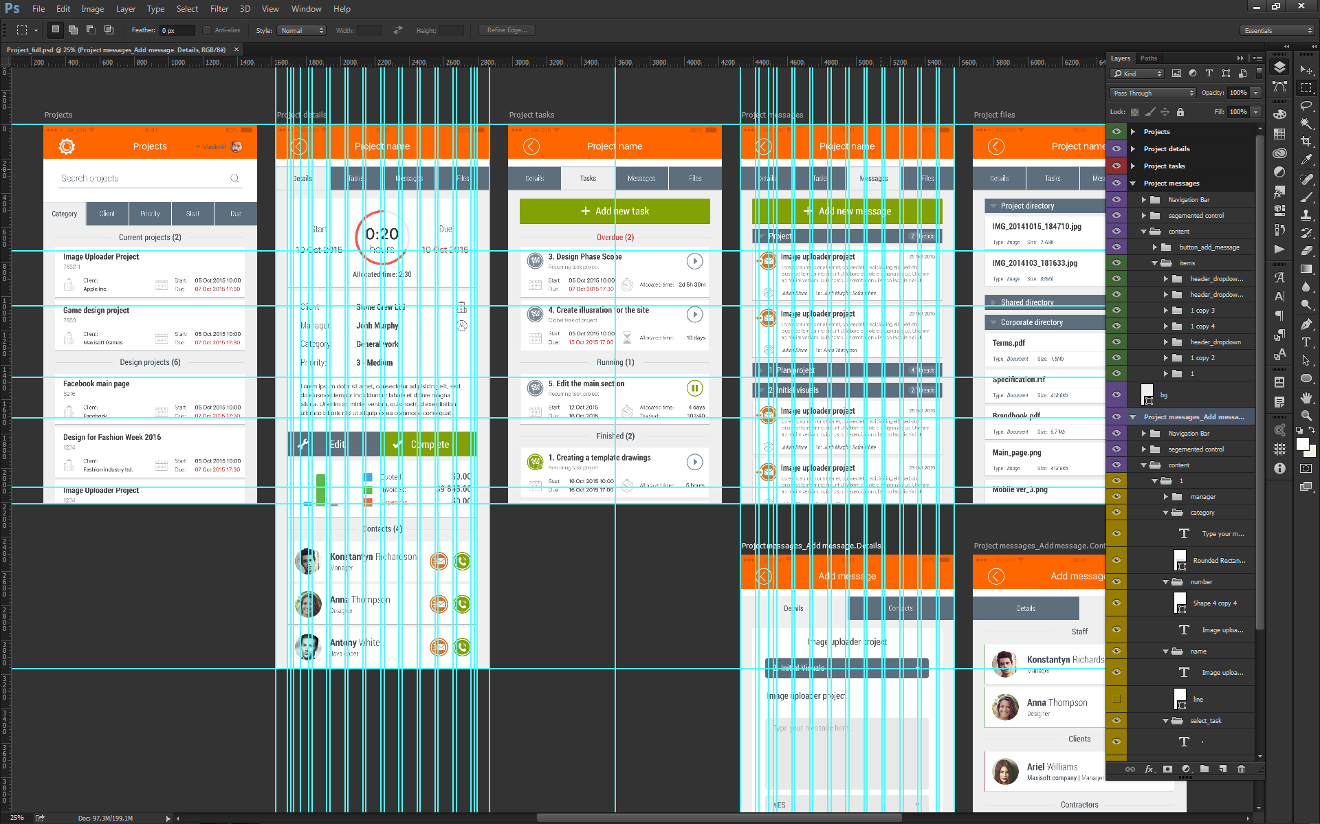
1) As it was in the previous version 
2) As it is now with a 
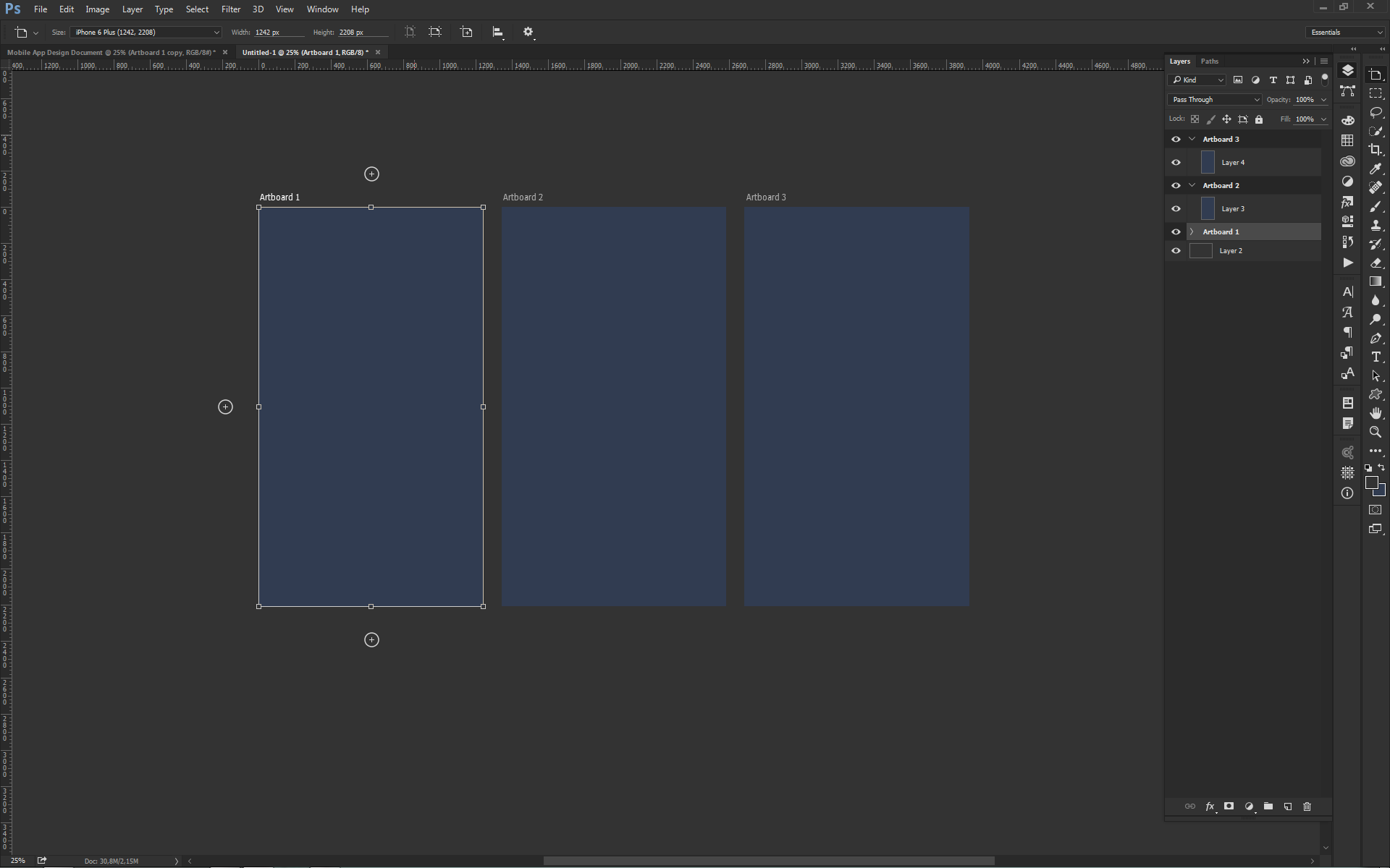
background 3) How it should be without a background (corrected by filling the background with the background color of the workspace)
Answer the question
In order to leave comments, you need to log in
Didn't find what you were looking for?
Ask your questionAsk a Question
731 491 924 answers to any question