Answer the question
In order to leave comments, you need to log in
How can the site header be improved?
Hello.
There is a site under development, the main page has almost been made up, the emphasis has been placed on minimalism, so that there is nothing superfluous. But the site looks completely white. And Heather looks bad. Is there anyone who can look at and advise on the design for free?
https://jobsnearby.herokuapp.com/
Answer the question
In order to leave comments, you need to log in
1. found a bug with you
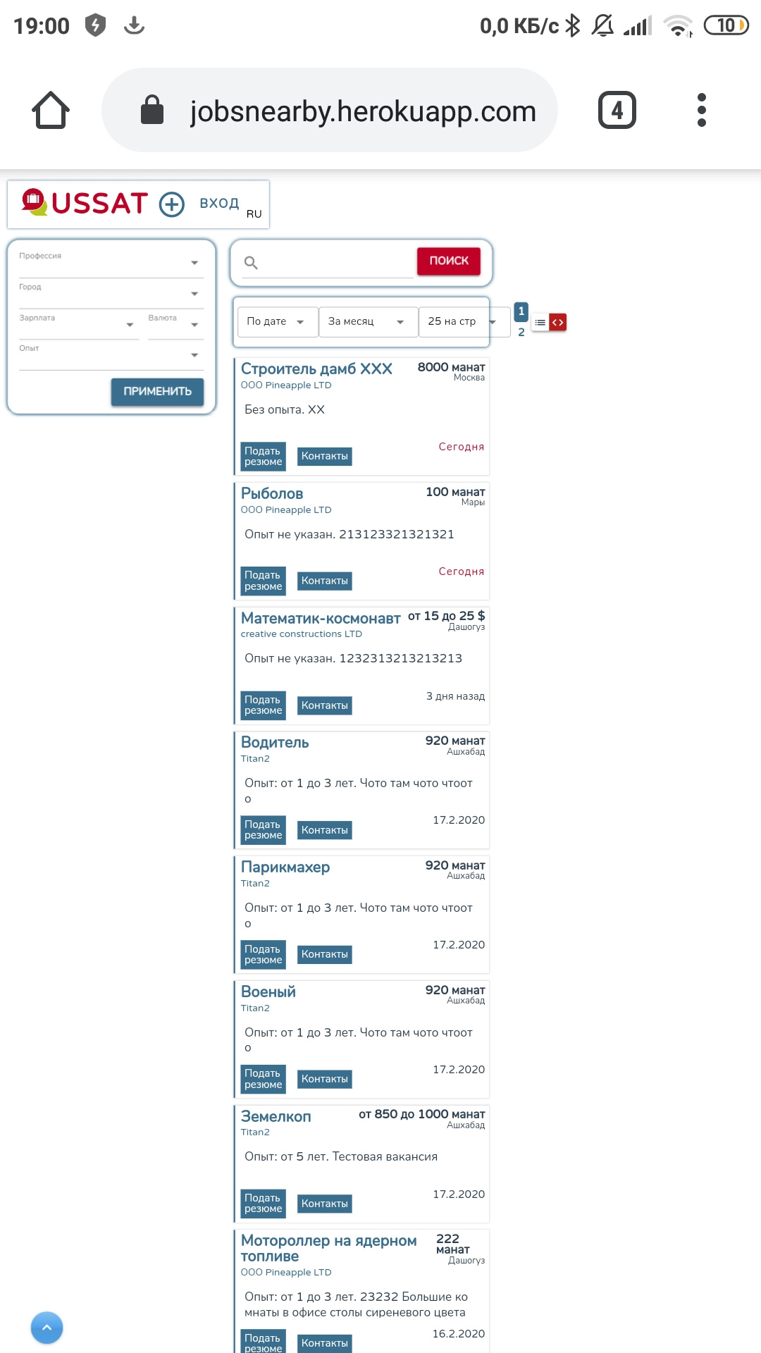
the emphasis was on minimalism
But the site looks completely white
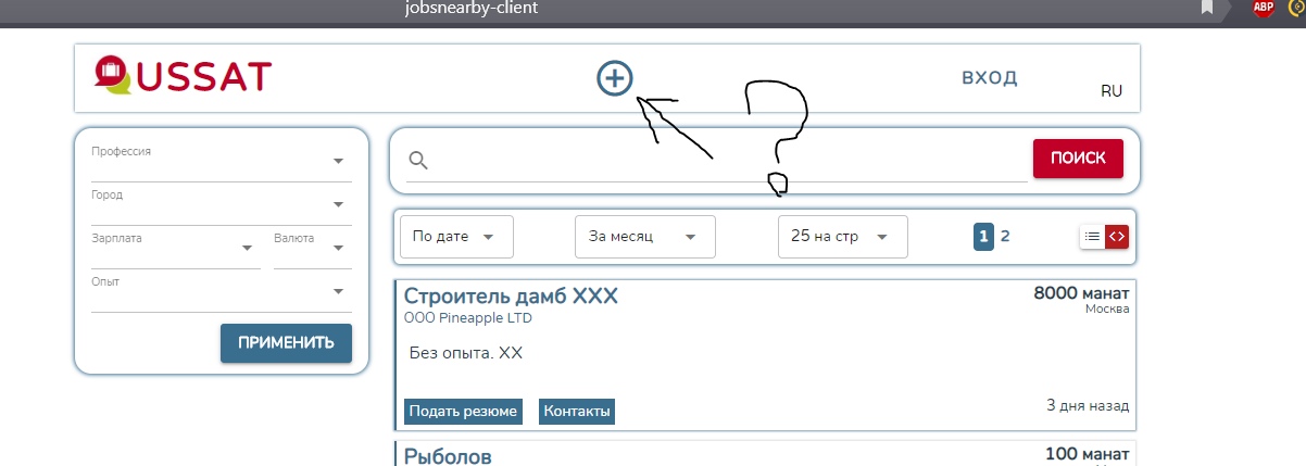 , and in order to understand it, you need to hover over it again
 Didn't find what you were looking for?
Ask your questionAsk a Question
731 491 924 answers to any question