Answer the question
In order to leave comments, you need to log in
Fotorama image carousel goes beyond flex box border, how to fix?
There is a div with a display: flex parameter, inside 3 blocks of the same width with flex parameters: 1 1 0 (so that they are of equal size), if images are inserted inside each of the flex blocks with a width: 100% parameter, then the blocks remain the same size, no matter what images are used, and if you insert a fotorama carousel into these blocks, the sizes of the flex blocks go astray and they go beyond the parent. How can I align this carousel?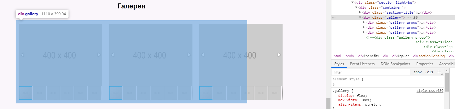
Answer the question
In order to leave comments, you need to log in
You can't set width: 100% in gallery_group, because this is a flex block and it will take the entire parent element, it already says flex: 1 1 0 for equal size
HTML example
<div class="gallery">
          <div class="gallery_group">
            <div class="fotorama" data-fit="cover" data-nav="thumbs" data-loop="true"
            data-maxwidth="100%" data-maxheight="300px" data-flexible="true">
              <img src="http://placehold.it/400x400"/>
              <img src="http://placehold.it/400x400"/>
              <img src="http://placehold.it/400x400"/>
              <img src="http://placehold.it/400x400"/>
              <img src="http://placehold.it/400x400"/>
              <img src="http://placehold.it/400x400"/>
              <img src="http://placehold.it/400x400"/>
              <img src="http://placehold.it/400x400"/>
              <img src="http://placehold.it/400x400"/>
              <img src="http://placehold.it/400x400"/>
              <img src="http://placehold.it/400x400"/>
              <img src="http://placehold.it/400x400"/>
            </div>
          </div>

          <div class="gallery_group">
            <div class="fotorama" data-fit="cover" data-nav="thumbs" data-loop="true"
            data-maxwidth="100%" data-maxheight="300px" data-flexible="true">
              <img src="http://placehold.it/400x400"/>
              <img src="http://placehold.it/400x400"/>
              <img src="http://placehold.it/400x400"/>
              <img src="http://placehold.it/400x400"/>
              <img src="http://placehold.it/400x400"/>
              <img src="http://placehold.it/400x400"/>
              <img src="http://placehold.it/400x400"/>
              <img src="http://placehold.it/400x400"/>
              <img src="http://placehold.it/400x400"/>
              <img src="http://placehold.it/400x400"/>
              <img src="http://placehold.it/400x400"/>
              <img src="http://placehold.it/400x400"/>
            </div>
</div>.gallery {
display: flex;
max-width: 100%;
align-items: stretch;
}
.gallery_group {
flex: 1 1 0;
padding: 16px;
}Didn't find what you were looking for?
Ask your questionAsk a Question
731 491 924 answers to any question