Answer the question
In order to leave comments, you need to log in
Filling a block with an animated border?
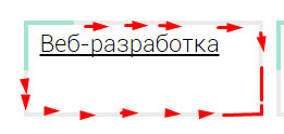
There is a block, 200 by 50 pixels. Which should have the upper and left corner set by the border, but not completely, but let's say only 50%, and when hovering over it, it should be filled with the border to the end, from both sides, smoothly.
For clarity, 
Guys, tell me an approximate implementation, or poke where you can read. because Google did not give me anything sensible on the topic :(
Answer the question
In order to leave comments, you need to log in
svg is better, but css is also possible
<div class="qwe">
        qweqwe
    </div>
    <style>
        .qwe{
            display: inline-block;
            padding: 20px;
            border: 2px solid lightgray;
            position: relative;
        }
        .qwe:before,
        .qwe:after{
            content: '';
            display: block;
            position: absolute;
            top: -2px;
            left: -2px;
            width: 0;
            height: 0;
        }
        .qwe:before{
            border-left: 0 solid green;
            border-bottom: 0 solid green;
        }
        .qwe:after{
            border-top: 0 solid green;
            border-right: 0 solid green;
        }
        .qwe:hover:before,
        .qwe:hover:after{
            border-width: 2px;
            height: calc(100% + 4px);
            width: calc(100% + 4px);
        }
        .qwe:hover:before{
            transition: height 1s linear , width 1s 1s linear ;
        }
        .qwe:hover:after{
            transition: width 1s linear , height 1s 1s linear ;
        }
</style>1. Use border-image with gradient and animate it.
2. Use :before and :after blocks. For the main block, the borders are set like this - the left and top gray, the right and bottom of the color you need. The :before block with zero dimensions, position: absolute to the top left corner, the top and left borders of the color you want, the :after block to the bottom right corner, the width and height of the parent block, the border color is gray.
On hover, animate the dimensions of the :before block to 100% of the parent block, the :after block to 0. You make the animation delay of the :after block such that it starts firing immediately after the :before animation ends.
It will turn out that the :before block expands to fill the left and right sides with the border of the desired color, and the :after block shrinks to remove the gray border and reveal the border of the desired color on the right and below.
Didn't find what you were looking for?
Ask your questionAsk a Question
731 491 924 answers to any question