Answer the question
In order to leave comments, you need to log in
Criticize the layout?
https://frozifonte.github.io/template-01/
Isn't it embarrassing to put such freelance work in your portfolio?
Answer the question
In order to leave comments, you need to log in
As a person with 12 years of experience in website development and an expert in
UI and
landings
, I can say one thing: forget about transformations and other unnecessary effects
... - Your client in 80% of visits is a person who has slow internet in his smartphone, he has clumsy thumbs, a small screen and the smartphone is old and lags... shitty design.
in headers 1 and 3 the links lead nowhere.
the site ends strangely, some footer is missing or at least indented.
popup goes crazy if you press the button many times with empty inputs
I will not say anything about the implementation, since I do not rummage in the front. I will say as a user.
"Order now for a promotion" - in this block, the indents between paragraphs would be more.
For some reason, the animation of the "order at a discount" button works in the opposite direction. The button should be pressed, not jumped. Not to mention that I didn't click anything, but the animation hints. It's better to just highlight with a different color on hover.
The visual right border of the top link block (where "Payment and Delivery") does not match the white block. They need to be even.
There is a concept of the most comfortable content width. So that you can read it without shaking your head. I would limit the content thickness of the second, third and fourth blocks to 1200px.
- Either remove the preloader completely or make its disappearance smoother, you have a static page and this flickering somehow doesn’t look very good;
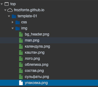
- it is better to name pictures in Latin:

- where the white background of the pictures is better to make it transparent, where there is no transparency, it is better to use jpg instead of png. It doesn’t matter on such small pages, but in the future it may be useful for optimization;
- add hover effects for menu items;
- remove the link from the logo, so it's a one-pager.
* {transition: .5s ease-in-out;}bad practice. You don't understand BEM at all. And for some reason it seems to me that the layout is not finished.
1. In other places, there are also text overlays on the image, button overlays over the image ....
Look at the width of the window
2. Indent from the bottom, otherwise how something was cut off from the bottom)))
If you show it on your monitor, then it's good)))
Isn't it embarrassing to put such freelance work in your portfolio?
Opened on mobile. Notes:
1. Preloader? On an html page? What is he doing, why is he?
2. The burger menu looks as unattractive as possible. See ready-made burger options with css animations.
3. This drop down menu style is 2015. Well, really, make a pop-up menu on the whole screen when you click on the menu, center the links vertically and horizontally for a start. Work on your own sense of beauty.
4. Somewhere the order button is blocked by a picture
5. the modal does not have a cross, to close it you need to hit the pixel past the window, so it should not be
ps the code itself is not viewed
Didn't find what you were looking for?
Ask your questionAsk a Question
731 491 924 answers to any question