Answer the question
In order to leave comments, you need to log in
Color harmony how to choose the right colors?
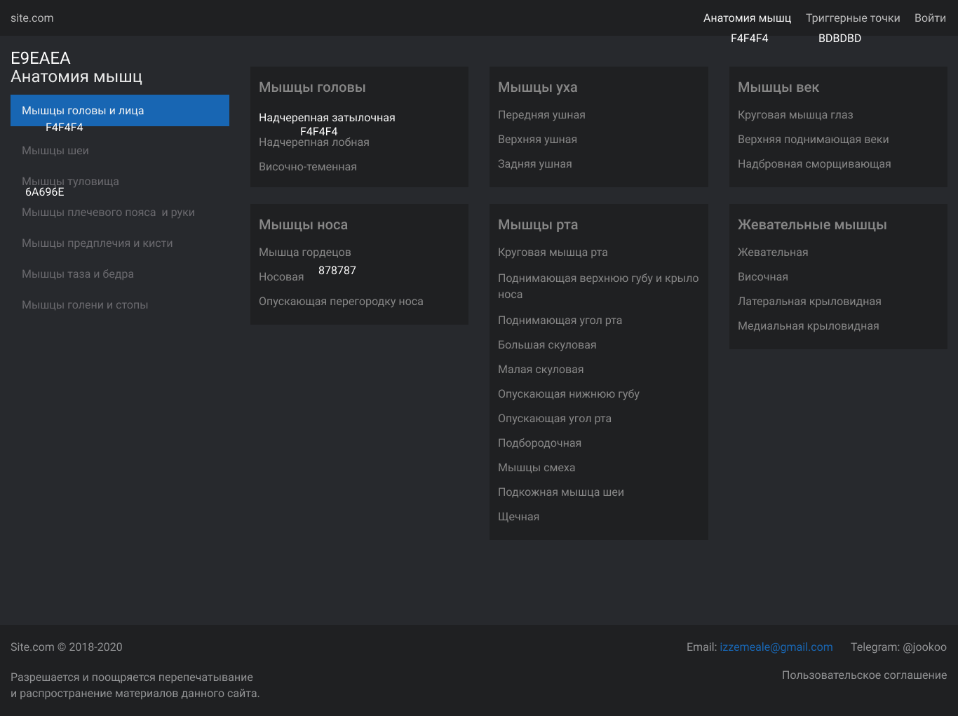
Good morning, I'm designing in dark colors and I can't seem to find the right colors for this page. At the moment, these colors are used, I marked them in the photo. I can't tell if they match or not. Please give me a couple of recommendations. There is a feeling that something is missing.

Here is the main page

Answer the question
In order to leave comments, you need to log in
Small palette. If blue is taken for an accent, then you need to stock up a few more blues (of the same shade, but of different brightness), even though they will be rarely used, but it is better to determine them in advance. Here at least take the line e-mail - the blue suggests itself lighter, tk. this one is not very well read against such a background.
Well, for selection: https://colorscheme.ru/#3L61T1B6p6q6q
I'll tell you on the first slide.
A simple rule for a block with a heading:
1. Or heading font: bold + accent and separating the accent color from the main content with a thin stylish horizontal line that does not reach the edges of the block.
2. Or title font: bold + block background and title background: accent. The background "touches" all three sides of the card - as it were, a rectangular fill of the title label area.
Making the perimeter of the block for styling under the theme of the site:
stroke, "corners", "petals" (such as tabs, etc.) and so on - already to taste, but adhering to the direct (p. 1) or inverse (p. 2) accent .
On the main menu:
It should not "hang in the air".
Or "hang" from above, or "attach" to the left of the page, or put a vertical bar (like here, on this site, where you are reading right now, on the left).
Circle the entire menu area with the outline of the main font color and slightly darken its background in relation to the general background. It will immediately become easier to read the text of the menu, without attracting too much attention.
Didn't find what you were looking for?
Ask your questionAsk a Question
731 491 924 answers to any question