Answer the question
In order to leave comments, you need to log in
Bootstrap 3 element positioning?
In bootstrap, if the elements don't fit on the screen, then the right element falls under the left element. Is it possible to do the opposite, so that the right one floats over the left, but not for all elements, but for certain ones?
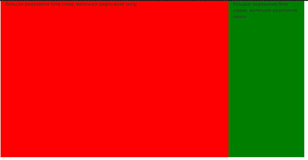
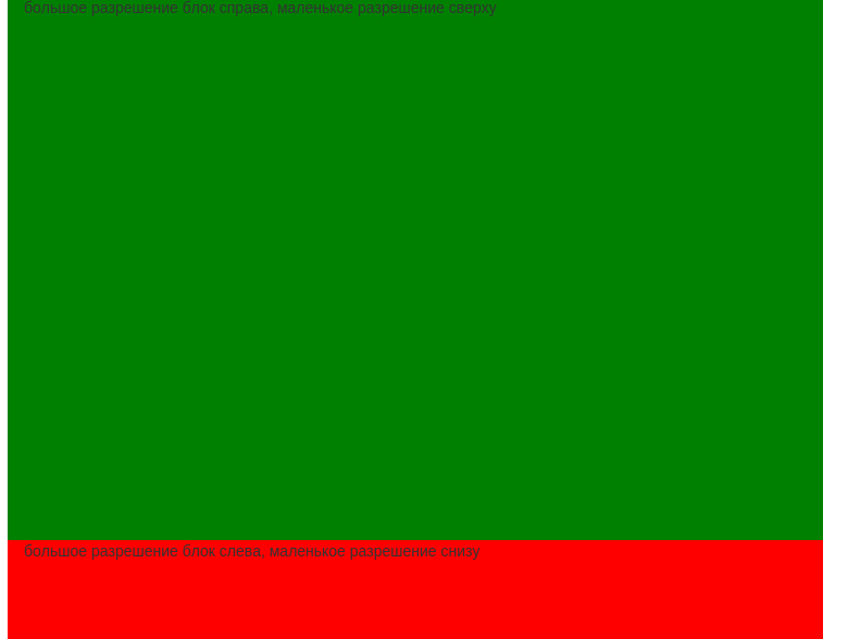
For example: 2 blocks
<div class="container">
            <div class="row">
                <div class="col-md-5" style="background-color:red;height:500px"></div>
                <div class="col-md-7" style="background-color:green;height:500px"></div>
            </div>
        </div>


Answer the question
In order to leave comments, you need to log in
Swap the columns in the code, those that should be on the right - float: right
Didn't find what you were looking for?
Ask your questionAsk a Question
731 491 924 answers to any question