Answer the question
In order to leave comments, you need to log in
Another question about the adaptive table. Or better not a table?
There is a drawing that needs to be translated in some way into a form that is digestible for all resolutions.
There is an opinion to make everything a table, well, that is, not necessarily a tabular layout, but for example flex - for desktops 5 columns in 3 rows, in mobile resolutions on the contrary - 5 rows, the first 2 rows of 3 columns, the remaining 3 rows of 2 columns.
Or maybe something else that will help you look better?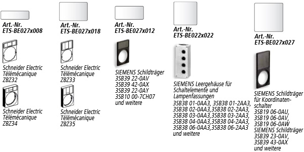
Answer the question
In order to leave comments, you need to log in
For desktops, 5 columns in 3 rows, in mobile resolutions, on the contrary, 5 rows, the first 2 rows have 3 columns, the remaining 3 rows have 2 columns.
Didn't find what you were looking for?
Ask your questionAsk a Question
731 491 924 answers to any question