Answer the question
In order to leave comments, you need to log in
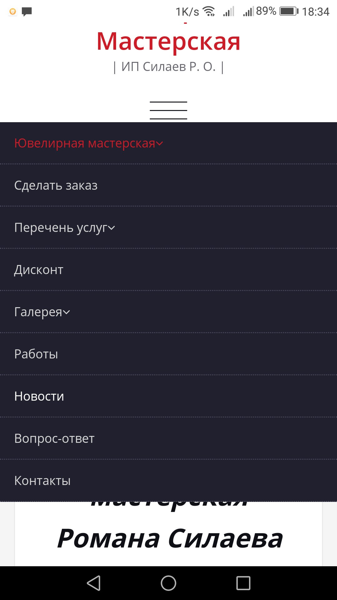
Why is the smartphone site menu automatically displayed open (without the ability to close it)?
 (Link to the resource https://silaevgold.ru)
I completely despaired of finding a solution on my own.
How can I fix the situation so that the menu, when optimized for smartphones, does not open automatically when the page is loaded (while closing part of the page and not closing after selecting any item).
Many thanks in advance for your help, and I apologize for such a vague wording and perhaps the wrong array of code, I'm not sure that I could even localize the problem accurately)!
.dropup,
.dropdown {
  position: relative;
}
.dropdown-toggle:focus {
  outline: 0;
}
.dropdown-menu {
  position: absolute;
  top: 100%;
  left: 0;
  z-index: 1000;
  display: none;
  float: left;
  min-width: 160px;
  padding: 5px 0;
  margin: 2px 0 0;
  font-size: 14px;
  text-align: left;
  list-style: none;
  background-color: #fff;
  -webkit-background-clip: padding-box;
          background-clip: padding-box;
  border: 1px solid #ccc;
  border: 1px solid rgba(0, 0, 0, .15);
  border-radius: 4px;
  -webkit-box-shadow: 0 6px 12px rgba(0, 0, 0, .175);
          box-shadow: 0 6px 12px rgba(0, 0, 0, .175);
}
.dropdown-menu.pull-right {
  right: 0;
  left: auto;
}
.dropdown-menu .divider {
  height: 1px;
  margin: 9px 0;
  overflow: hidden;
  background-color: #e5e5e5;
}
.dropdown-menu > li > a {
  display: block;
  padding: 3px 20px;
  clear: both;
  font-weight: normal;
  line-height: 1.42857143;
  color: #333;
  white-space: nowrap;
}
.dropdown-menu > li > a:hover,
.dropdown-menu > li > a:focus {
  color: #262626;
  text-decoration: none;
  background-color: #f5f5f5;
}
.dropdown-menu > .active > a,
.dropdown-menu > .active > a:hover,
.dropdown-menu > .active > a:focus {
  color: #fff;
  text-decoration: none;
  background-color: #337ab7;
  outline: 0;
}
.dropdown-menu > .disabled > a,
.dropdown-menu > .disabled > a:hover,
.dropdown-menu > .disabled > a:focus {
  color: #777;
}
.dropdown-menu > .disabled > a:hover,
.dropdown-menu > .disabled > a:focus
.open > .dropdown-menu {
  display: block;
}
.open > a {
  outline: 0;
}
.dropdown-menu-right {
  right: 0;
  left: auto;
}
.dropdown-menu-left {
  right: auto;
  left: 0;
}
.dropdown-header {
  display: block;
  padding: 3px 20px;
  font-size: 12px;
  line-height: 1.42857143;
  color: #777;
  white-space: nowrap;
}
.dropdown-backdrop {
  position: fixed;
  top: 0;
  right: 0;
  bottom: 0;
  left: 0;
  z-index: 990;
}
.pull-right > .dropdown-menu {
  right: 0;
  left: auto;
}
.dropup .caret,
.navbar-fixed-bottom .dropdown .caret {
  content: "";
  border-top: 0;
  border-bottom: 4px solid;
}
.dropup .dropdown-menu,
.navbar-fixed-bottom .dropdown .dropdown-menu {
  top: auto;
  bottom: 100%;
  margin-bottom: 2px;
}
@media (min-width: 768px) {
  .navbar-right .dropdown-menu {
    right: 0;
    left: auto;
  }
  .navbar-right .dropdown-menu-left {
    right: auto;
    left: 0;
  }
}Answer the question
In order to leave comments, you need to log in
First, in order for the menu button to work, give it the following data-target attribute: data-target="#menu-menu-1" .
Next, add the " in " class to the block with id#custom-collapse
After performing these manipulations in the browser, everything worked for me.
Didn't find what you were looking for?
Ask your questionAsk a Question
731 491 924 answers to any question