Answer the question
In order to leave comments, you need to log in
Why is the site walking on mobile screens?
I decided to practice layout for mobile devices, made up the whole layout and ran into the following problem.
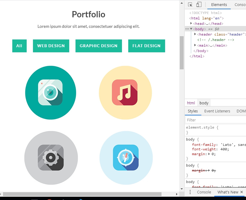
When the site is on the desktop in the browser, everything looks right

And it even adapts normally to the size of the screens
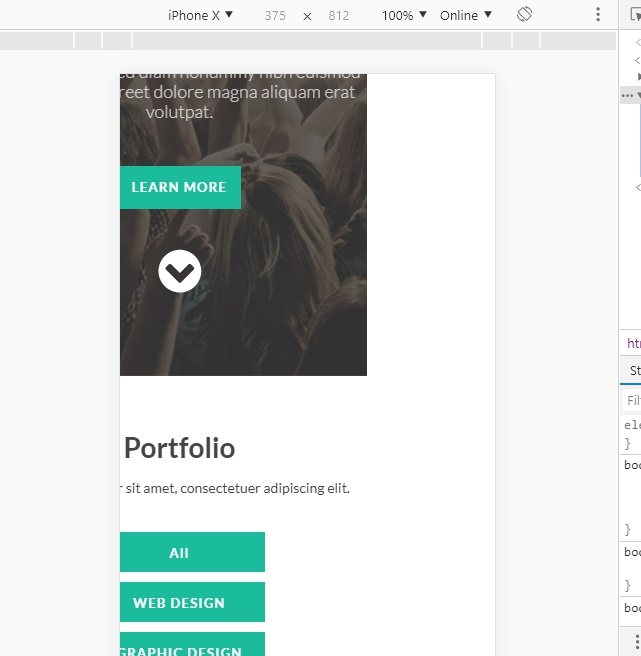
But as soon as I decide to switch to any mobile version (iphone x for example), everything immediately becomes incomprehensible
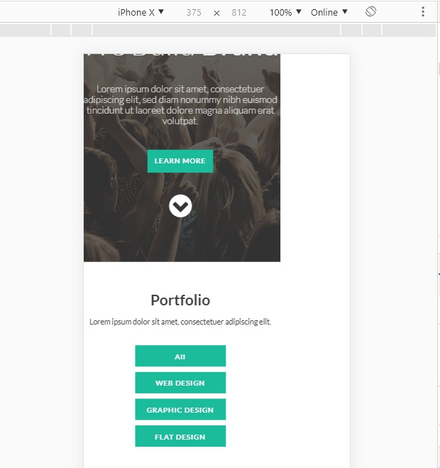
If I press any button, the site gets up as it should, but at the same time I can move the site itself to the left
How to fix this?
Here is the code https://jsfiddle.net/ily4famer/hmt21wzk/1/
Answer the question
In order to leave comments, you need to log in
@media (max-width: 730px) {
  .team-people {
    width: 700px;
  }
}.team-people {
width: 785px;
}.portfolio-form {
width: 510px;
}Because you may have something out of scope, just delete everything until it happens, how do you delete that div and you won’t walk, restore the code and work with the broken div class
Wanted to help saw the structure
<header class="header">
        <div class="container">
            <div class="header-block">
                <div class="header-logo">
                    <div class="header__img">
                        <img src="img/logo.png" alt="BAK-ONE">
                    </div>
                    <div class="header__text">
                        <!-- /.header__logo -->
                        <div class="header__title">BAK-ONE</div>
                        <!-- /.header__title -->
                        <div class="header__subtitle">One Page Flat Template</div>
                        <!-- /.header__subtitle -->
                    </div>
                    <!-- /.header-text -->
                </div>
<!-- /.header-img -->Didn't find what you were looking for?
Ask your questionAsk a Question
731 491 924 answers to any question