Answer the question
In order to leave comments, you need to log in
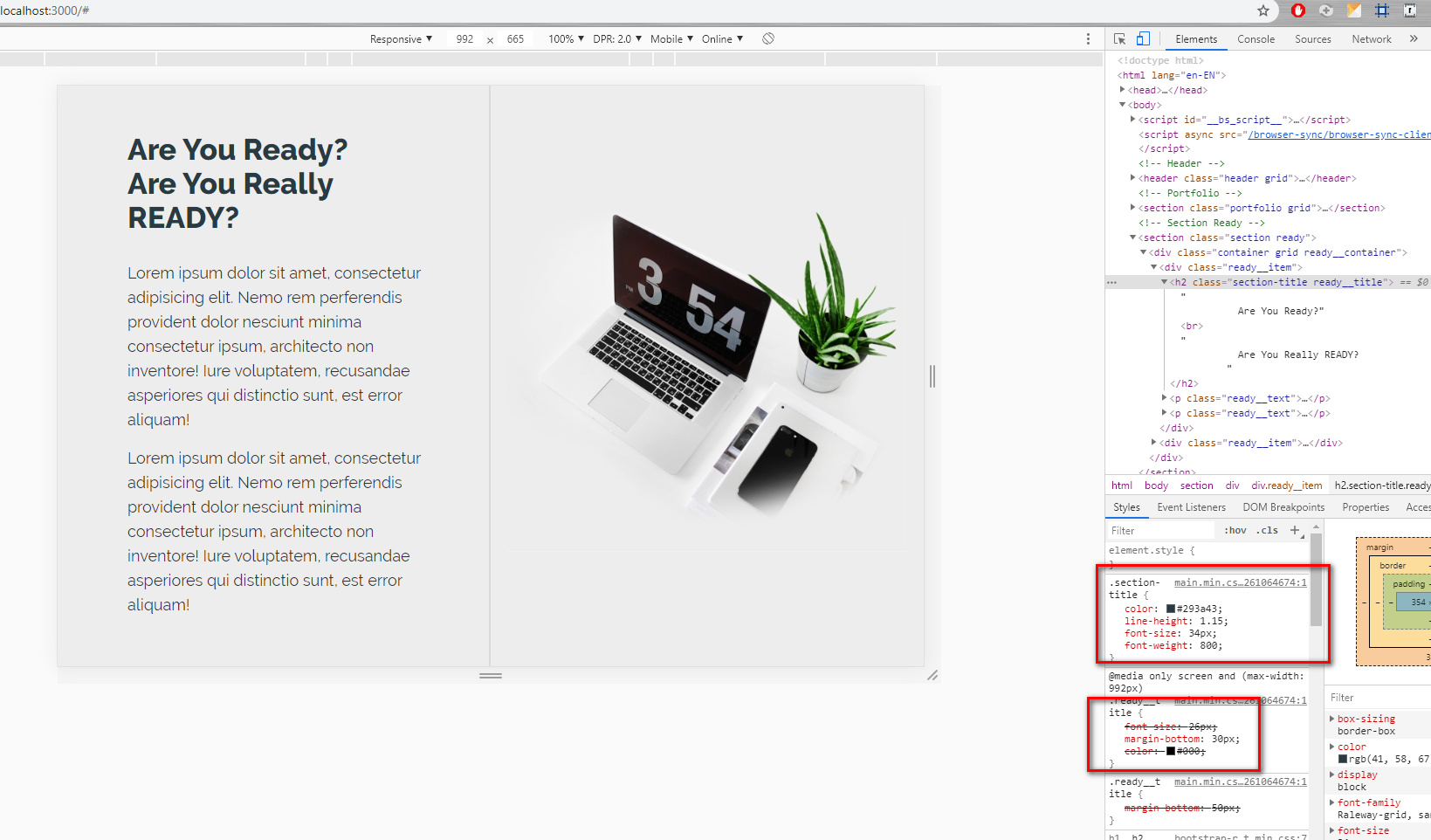
Why is the redefinition of the second one ignored when using two classes per h1 header?
I think the question is quite simple, but I can’t understand the logic of redefining styles in media queries.
There is this code:
<section class="section ready">
    <div class="container grid ready__container">
      <div class="ready__item">
        <h2 class="section-title ready__title">
          Are You Ready?<br>
          Are You Really READY?
        </h2>
        <p class="ready__text">Lorem ipsum dolor sit amet, consectetur adipisicing elit. Nemo rem perferendis provident dolor nesciunt minima consectetur ipsum, architecto non inventore! Iure voluptatem, recusandae asperiores qui distinctio sunt, est error aliquam!</p>
        <p class="ready__text">Lorem ipsum dolor sit amet, consectetur adipisicing elit. Nemo rem perferendis provident dolor nesciunt minima consectetur ipsum, architecto non inventore! Iure voluptatem, recusandae asperiores qui distinctio sunt, est error aliquam!</p>
      </div>

      <div class="ready__item">
        <img src="img/ready/notebook.jpg" alt="Notebook" class="ready__image img-responsive">
      </div>

    </div>
</section>@import 'fonts'
@import 'libs'
@import 'base'
@import 'variables'
@import 'buttons'
@import 'blocks/header'
@import 'blocks/portfolio'
@import 'blocks/ready'
@import 'blocks/form'
@import 'blocks/blog'
@import 'blocks/footer'
@import 'media'
.grid
display: grid
.container
max-width: 1200px
margin: auto
padding: 0 $gutter
.section
padding: 80px 0
&-title
color: $dark
line-height: 1.15
font-size: 34px
font-weight: 800.ready
&__title
margin-bottom: 50px@media only screen and (max-width : 992px)
.ready
&__title
font-size: 26px
margin-bottom: 30px
color: #000
Answer the question
In order to leave comments, you need to log in
You misunderstood the principle of working with media queries.
CSS styles styled with media queries do not take precedence. They are applied exactly in the place where they are indicated, but under the given conditions.
In order for everything to work as you need, you need to move it to
the end of the main.sass file.
@import 'media'
Didn't find what you were looking for?
Ask your questionAsk a Question
731 491 924 answers to any question