Answer the question
In order to leave comments, you need to log in
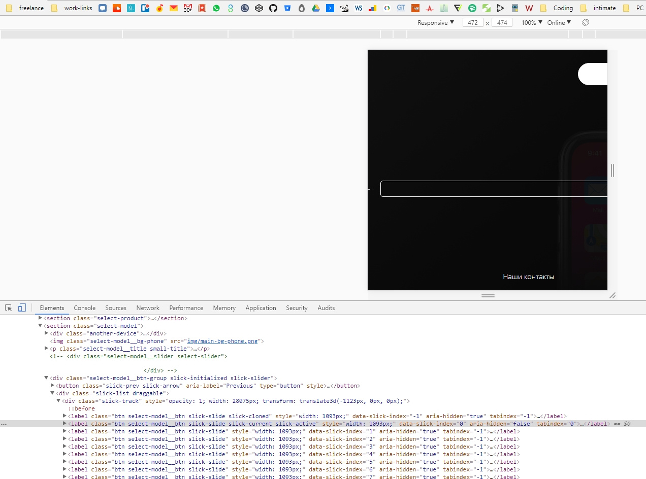
Why is slick not adapting?
Everything on the site: reappl.com/index_dan.html
We need to make the slider responsive. I go to the site slick. There I take a responsive site and set it for myself. At the output, I see that the slides have a width of 350px, when the screen width is 480px, what's the problem? Where does he get these 1093px from and how can I adapt it all the same?
Write what styles you need if you want to help.
$('.select-model__btn-group').slick({
    slidesToShow: 9,
    slidesToScroll: 1,
    responsive: [
        {
          breakpoint: 1024,
          settings: {
            slidesToShow: 5,
            slidesToScroll: 5,
          }
        },
        {
          breakpoint: 600,
          settings: {
            slidesToShow: 3,
            slidesToScroll: 3,
          }
        },
        {
          breakpoint: 480,
          settings: {
            slidesToShow: 1,
            slidesToScroll: 1,
          }
        }
        // You can unslick at a given breakpoint now by adding:
        // settings: "unslick"
        // instead of a settings object
    ]
});
Answer the question
In order to leave comments, you need to log in
Issue resolved. Set max-width: 100vw; max-width: 1000px Upon reboot, everything worked out correctly.
Didn't find what you were looking for?
Ask your questionAsk a Question
731 491 924 answers to any question