Answer the question
In order to leave comments, you need to log in
Why is only one media query applied via Sass?
Only 1 media query will be applied regardless of screen resolution. Tried swapping it this way and that and it's still the same.
https://github.com/Aidar9500/untitled2.git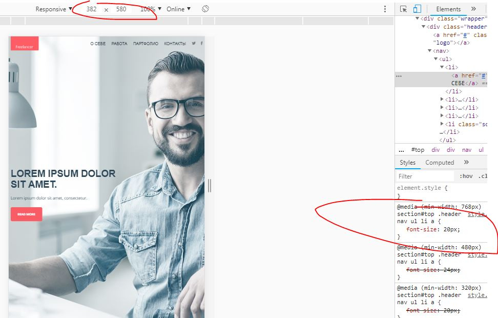
a{
font-size: 14px;
@include mq-small {
font-size: 18px;
}
@include mq-small-up {
font-size: 20px;
}
@include mq-medium {
font-size: 22px;
}
@include mq-medium-up {
font-size: 24px;
}
@include mq-larger {
font-size: 20px;
}
}
in /*_setting.scss*/
$larger: 768px;
$medium: 480px;
$small: 320px;
@mixin mq-larger {
media (min-width: $larger) {
@content;
}
}
@mixin mq-medium-up {
media (min-width: $medium) {
@content;
}
}
@mixin mq-medium {
media (min-width: $medium) and (max-width: $larger - 1px) {
@content;
}
}
@mixin mq-small-up {
media (min-width: $small) {
@content;
}
}
@mixin mq-small {
media (min-width: $small) and (max-width: $medium - 1px){
@content;
}
}
Answer the question
In order to leave comments, you need to log in
1. This request is the last one and we really need to raise it.
2. SASS \ SCSS in its pure form is usually not used, but converted to CSS, if so, then before this operation, all changes will not lead to anything.
Since you write media queries from smallest to largest (mobile-first), they should be in that order.
@mixin mq-small {
  media (min-width: $small) and (max-width: $medium - 1px){
    @content;
  }
}
@mixin mq-small-up {
  media (min-width: $small) {
    @content;
  }
}
@mixin mq-medium {
  media (min-width: $medium) and (max-width: $larger - 1px) {
    @content;
  }
}
@mixin mq-medium-up {
  media (min-width: $medium) {
    @content;
  }
}
@mixin mq-larger {
  media (min-width: $larger) {
    @content;
  }
}Didn't find what you were looking for?
Ask your questionAsk a Question
731 491 924 answers to any question