Answer the question
In order to leave comments, you need to log in
Why is @media applied differently in Safari?
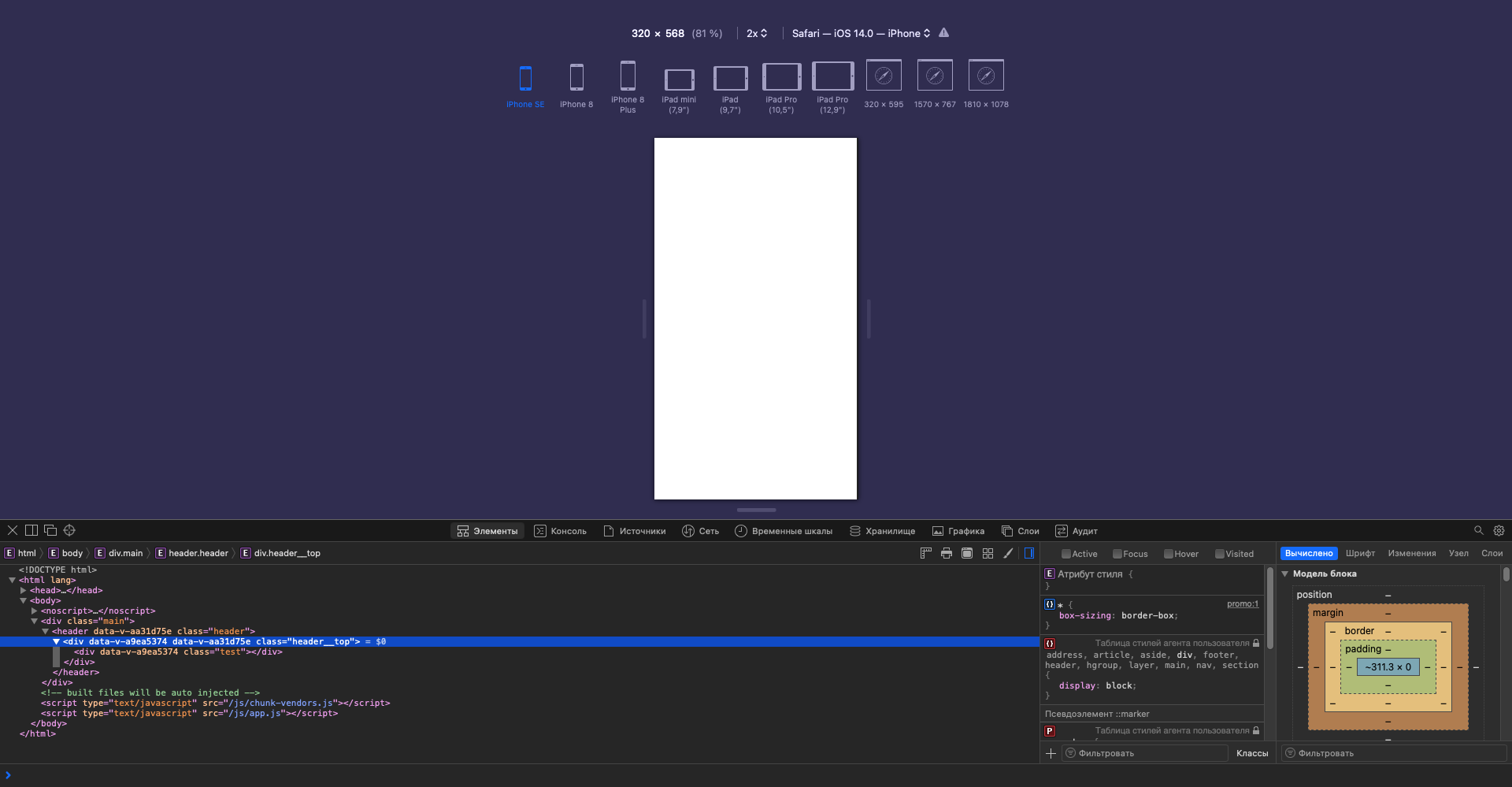
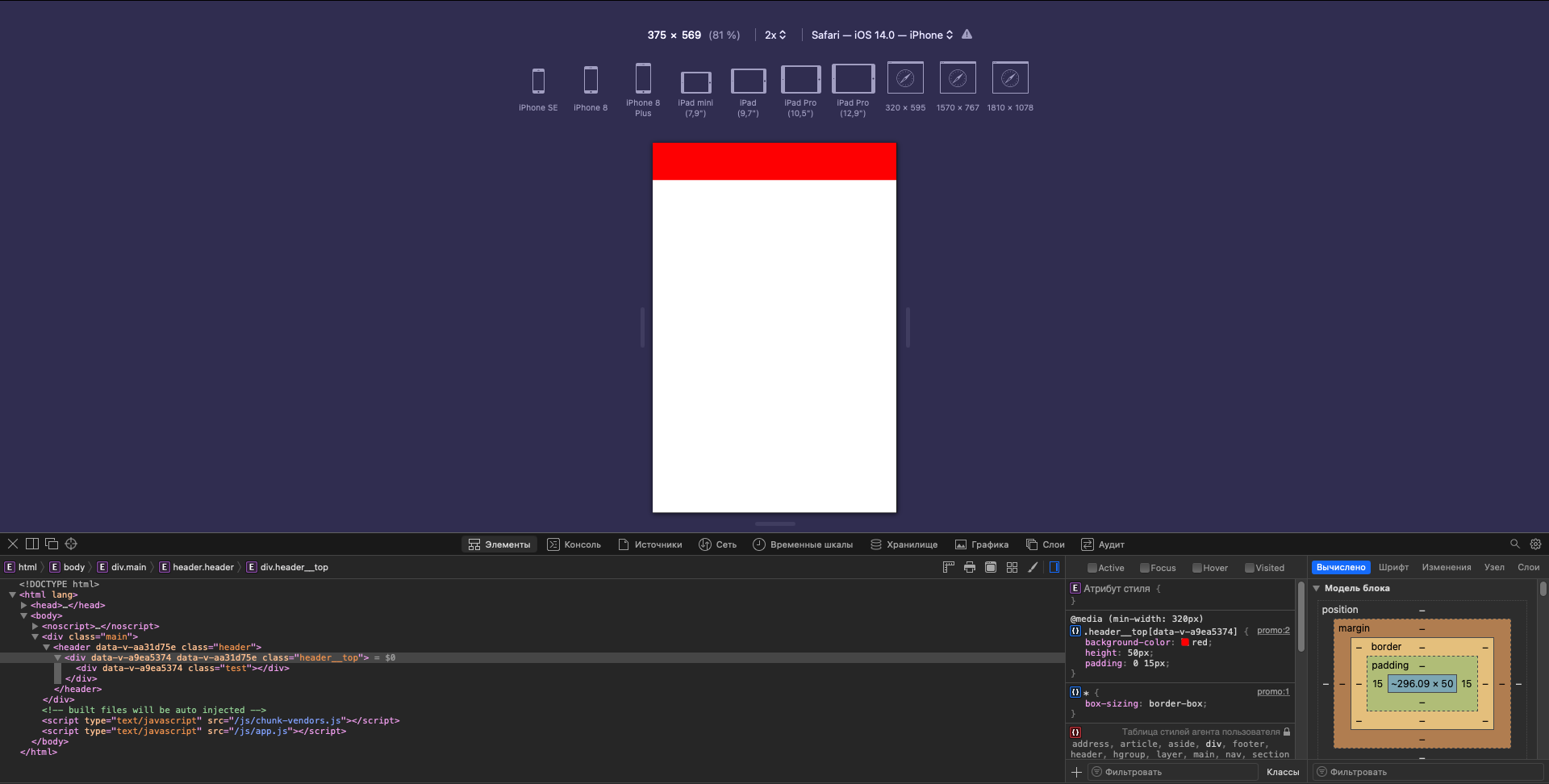
Safari 14.1.2
The crux of the matter is as follows.
I'll start by saying it
only starts working at 375px (I'm looking in Responsive Design Mode)
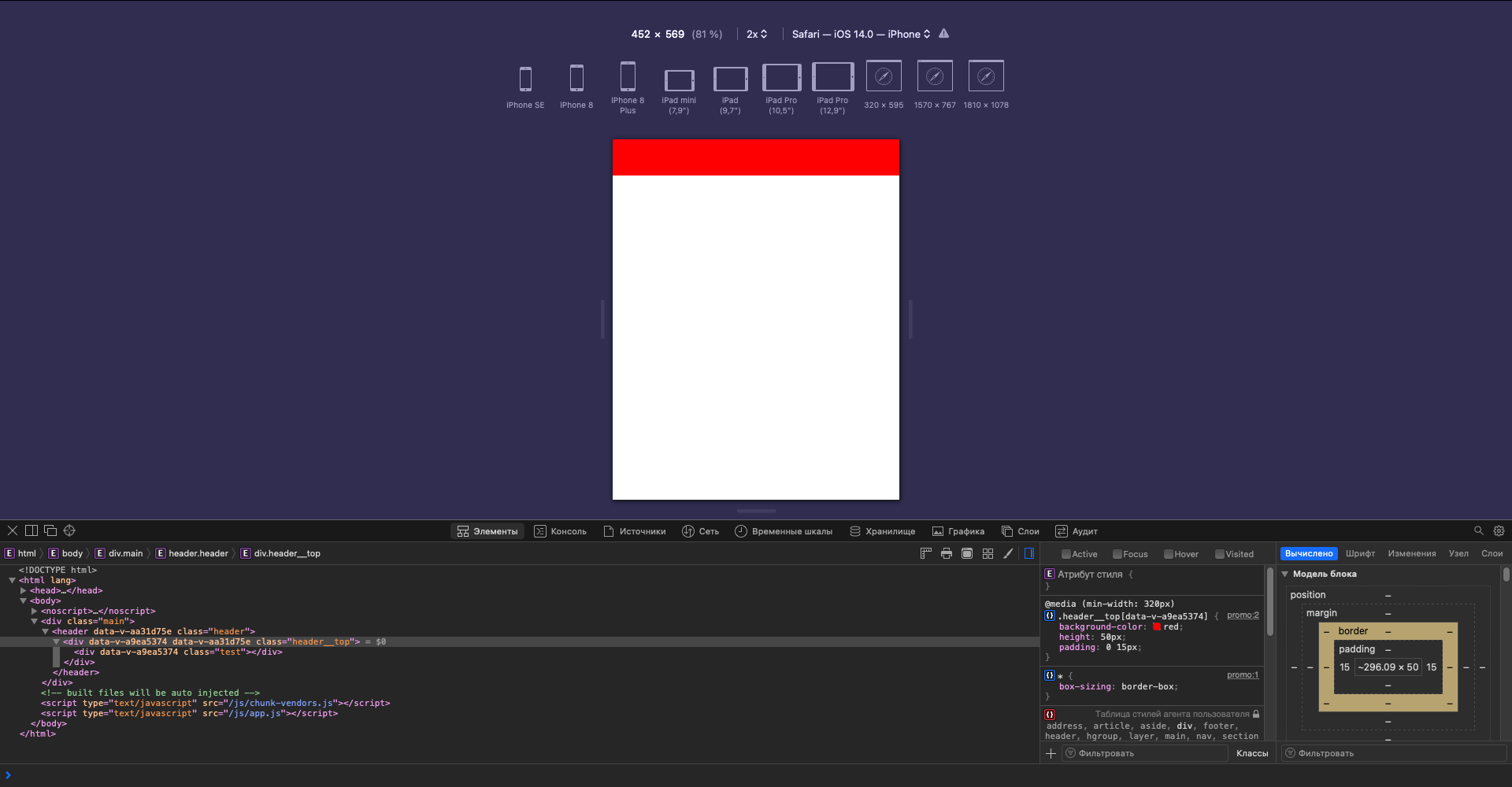
The next media query is supposed to apply its properties starting at 400px, but in reality it only starts applying them at 460px
Here's my meta tag
@media (min-width: 320px)
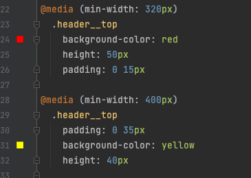
@media (min-width: 400px)
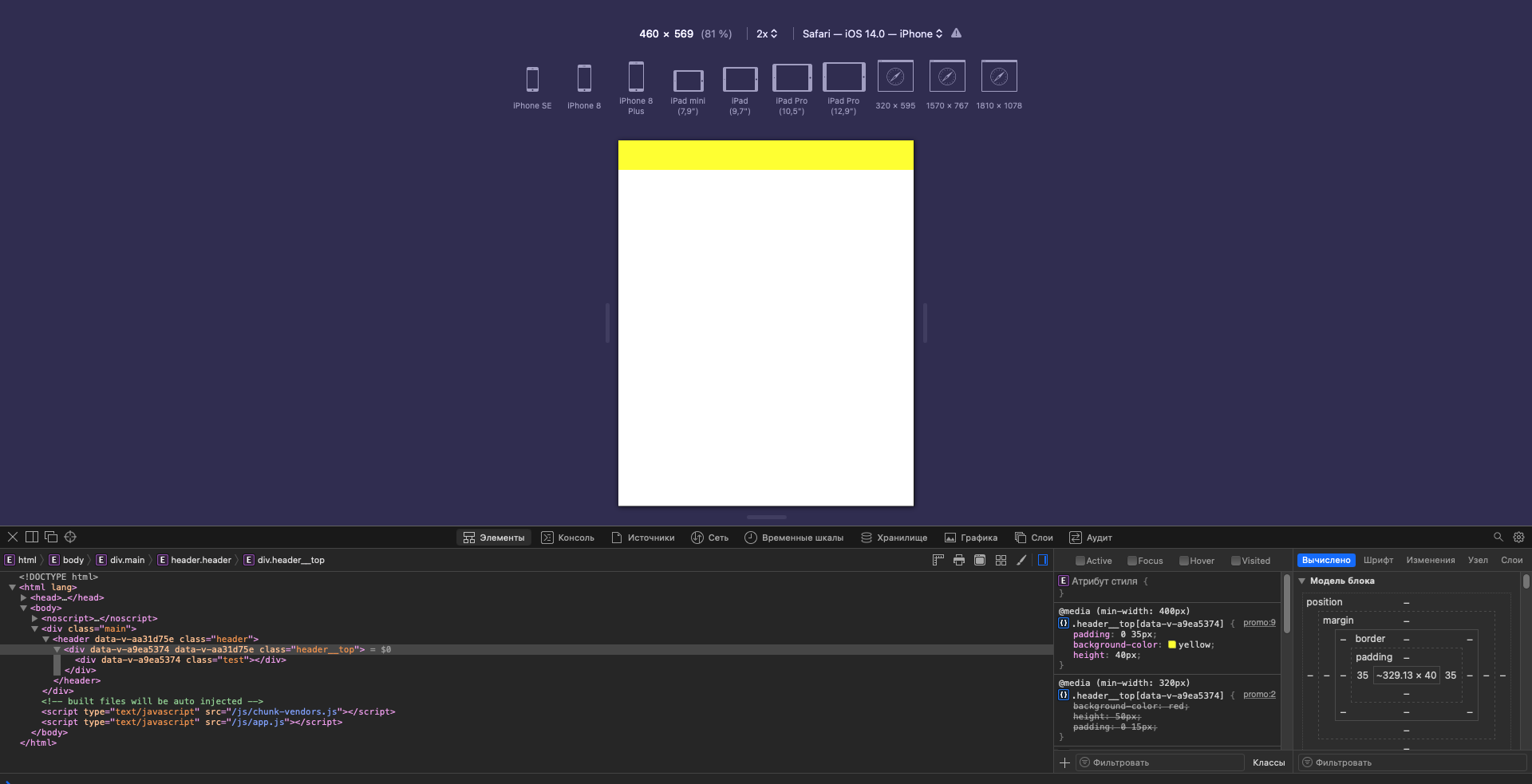
<meta name="viewport" content="width=device-width, user-scalable=no, initial-scale=1.0, maximum-scale=1.0, minimum-scale=1.0">@media (min-width: 1024px)@media (max-width: 1024px)@media (min-width: 1024px)Answer the question
In order to leave comments, you need to log in
The answer is ridiculously stupid, I haven’t gotten used to the browser itself yet, and without noticing it, I accidentally slightly changed the scaling. The problem is solved, the key combination command / ctrl + 0 reset the scale and everything behaves according to the standard.
Didn't find what you were looking for?
Ask your questionAsk a Question
731 491 924 answers to any question