Answer the question
In order to leave comments, you need to log in
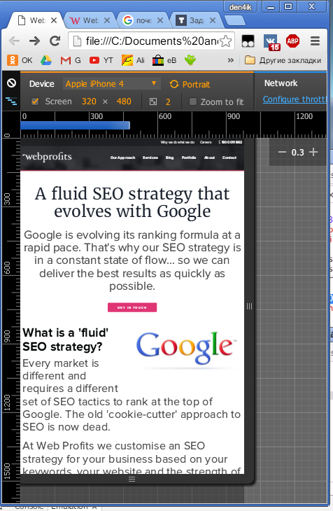
Why doesn't media queries work?
Please help me solve my problem.
The bottom line is that when the browser window is resized, media queries are triggered, and if you open the same document on a phone or tablet (with screens corresponding to breakpoints), then nothing happens.
connected like this:
<link rel='stylesheet' media='screen and (max-width: 480px)' href='media_queries.css' />@media only screen and (max-width: 480px) {
.....
}

Answer the question
In order to leave comments, you need to log in
add this line
<meta name="viewport" content="width=device-width, initial-scale=1">Didn't find what you were looking for?
Ask your questionAsk a Question
731 491 924 answers to any question