Answer the question
In order to leave comments, you need to log in
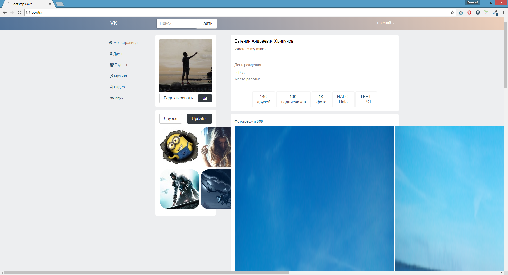
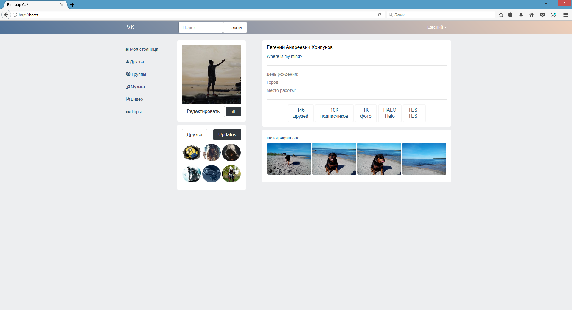
Why doesn't d-flex-inline work in Chrome?
I wanted to try to reproduce the design of VK. I'm using Bootstrap 4. Divided the page into parts using the col grid. I put pictures in blocks. Made the images responsive.
img{
    display: block;
    max-width: 100%;
    height: auto;
    border-radius: 5px;
}<div class="col-3 mainnav" style="min-width: 150px">
<div class="myblock">
<img src="images/vkavamedium.jpg" style="padding-bottom: 5px">
<button class="btn btn-secondary">Редактировать</button>
<button class="btn btn-dark fa fa-bar-chart"></button>
</div>
<div class="myblock">
<button class="btn btn-secondary ">Друзья</button>
<button class="btn btn-dark pull-right">Updates</button>
<div class="photofriend" style="margin-top: 10px">
<div class="d-inline-flex">
<img src="images/friends/1.jpg">
<img src="images/friends/2.jpg">
<img src="images/friends/3.jpg">
</div>
<div class="d-inline-flex">
<img src="images/friends/4.jpg">
<img src="images/friends/5.jpg">
<img src="images/friends/6.jpg">
</div>
</div>
</div>
</div>.myblock{
display: block;
background-color: #ffffff;
width: 90%;
margin-bottom: 10px;
padding: 15px;
text-align: left;
border-radius: 5px;
}

Answer the question
In order to leave comments, you need to log in
Didn't find what you were looking for?
Ask your questionAsk a Question
731 491 924 answers to any question