Answer the question
In order to leave comments, you need to log in
Why does the layout get lost when the browser window is reduced and how to fix it?
It is necessary to lay out 5 columns (without adaptation for mobile devices) 
It seems that I succeeded, but when the browser window is reduced, everything goes astray 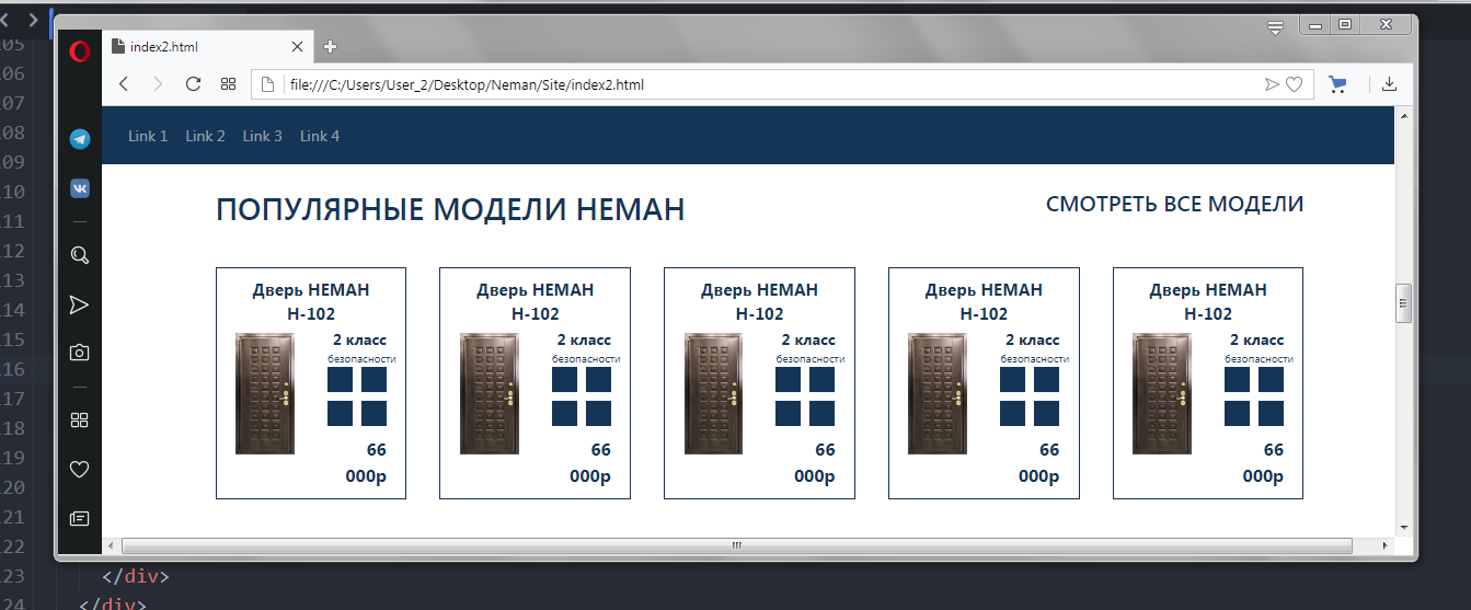
And when the window is reduced in the browser, everything is fine 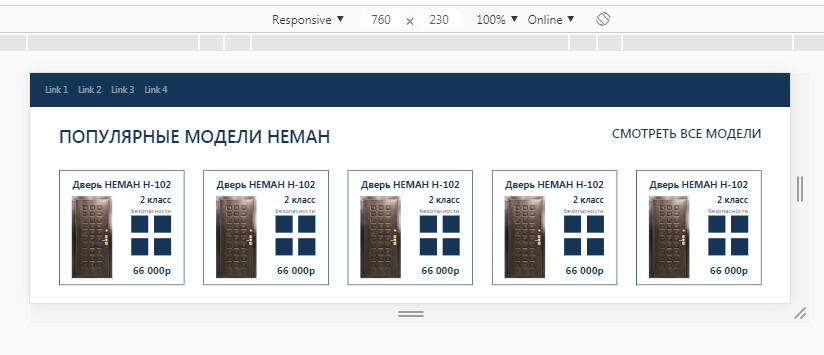
There are obviously some media queries, but I set the minimum page width to 1201 pixels (in bootstrap media queries no more than 1200 pixels, as far as I know), I need that when the page is reduced, a scroll from below simply appears, and nothing changes on the page.
<div class="container mb40">
    <div class="row justify-content-between mb30">
      <div class="col-auto"><h3>ПОПУЛЯРНЫЕ МОДЕЛИ НЕМАН</h3></div>
      <div class="col-auto"><h5>СМОТРЕТЬ ВСЕ МОДЕЛИ</h5></div>
    </div>
    <div class="row">

      <div class="col">
        <div class="object_popular">
          <b>Дверь НЕМАН Н-102</b>
          <div class="row">
            <div class="col-6"><img src="img1/n21.jpg" alt="" class="auto"></div>
            <div class="col-6 info">

                <div class="data"><b>2 класс</b><br />безопасности
                  <img src="img1/micro.png" alt="">
                </div>
                <div class="price"><b>66 000р</b></div>
            </div>
          </div>
        </div>
      </div>
    </div>
  </div>
.object_popular {
font-size: 15.2px;
padding: 5% 10%;
text-align: center;
border: 1px solid #153557;
}
.object_popular>.row {
margin-top: 5%;
}
.object_popular>.row>.info>.data>img {
max-width: 100%;
height: auto;
}Answer the question
In order to leave comments, you need to log in
10 out of 10 question. No code, no clarity of requirements....
That "everything goes astray"?
What version of Bootstrap are you using? What are class prefixes?
And in the end, maybe it's all about the scalability of the display - when you open it in a window, and not in full screen?
how much do you have in the meta viewport? so I think that you have a fixed value there. When minimizing the browser window, this value is not taken into account. You need to resize the container, make it fixed.
Look for a problem with price tags in CSS, you can do everything with them.
Didn't find what you were looking for?
Ask your questionAsk a Question
731 491 924 answers to any question