Answer the question
In order to leave comments, you need to log in
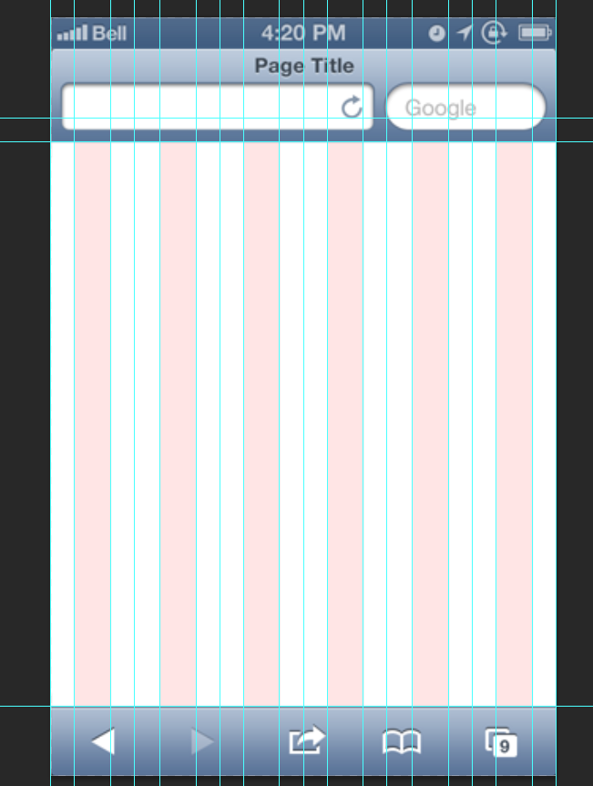
Why does the grid under bootstrap for mobile devices (320 px) have only 6 columns?
I downloaded the bootstrap grid for mobile devices, 320 px wide. There I saw only 6 columns, 23px wide and 30px indented. Is this the correct version and how to use it? Why 6 columns and not 12? How will it be laid out?
Answer the question
In order to leave comments, you need to log in

did you download it?
Everything is fine. the layout designer will simply use 2 columns instead of one.
and what are you going to do with 12 columns at a width of 320px?
Didn't find what you were looking for?
Ask your questionAsk a Question
731 491 924 answers to any question