Answer the question
In order to leave comments, you need to log in
Why does Safari's "perspective" CSS property break graphics optimization for 4K and 5K displays when reused?
Good afternoon.
I use this script from tumpanus, the SCALE & ROTATE PUSHER effect:
I have this block
.st-effect-11.st-container {-webkit-perspective: 1500px;perspective: 1500px;
} pressing the button, the st-container block will be displayed in perspective 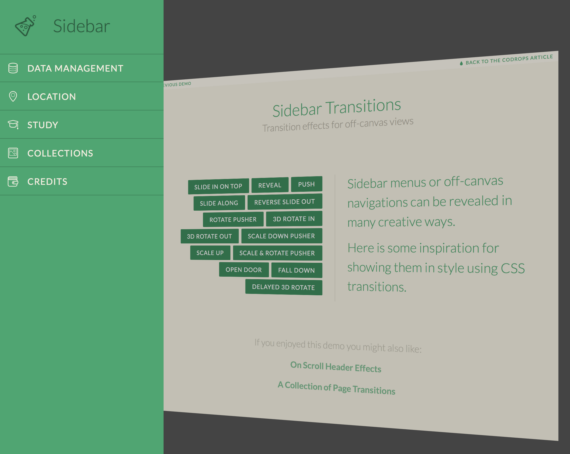
Here is my rake and the question itself:
All objects in the st-container block work well on 4K and 5K displays! BUT! If another perspective rule is applied to any block , then even the text / font inside this block is displayed at 4K and 5K blurred. This is not visible on normal displays.  Does anyone have any ideas how to fix this?
-------------
I tried to set the block to the default state
st-container {-webkit-perspective: none;perspective: none;}.st-effect-11.st-container {-webkit-perspective: 1500px;perspective: 1500px;}.st-effect-11.st-container {}
Answer the question
In order to leave comments, you need to log in
Well, yes, there's nothing to be done.
You can try giving the block being transformed transform : perspective(1px) translate..., i.e. changing the rule so that it contains perspective(1px).
Above is a possible option. Try setting the perspective directly on the desired element.
.st-effect-11.st-menu-open .st-pusher {
    perspective(1500px) translate3d(100px, 0, -600px) rotateY(-20deg)
}
.st-effect-11.st-container {}transform. That is, hang a callback on the event transitionend, and after the usual margin/left/topassign the necessary position for the sidebar. Accordingly, before hiding the sidebar, it needs to return the values again transform, then remove the offsets that you set in the callback, and only after that execute the command to hide. If you do this, then be sure to wrap the code in requestAnimationFrame, this is necessary so that the browser recalculates the styles in exactly the order you need, otherwise the styles will be assigned at once, and strange effects will appear (the animation will be performed through transition)let stMenuTransformPrevious, stMenuTransitionPrevious = ''
// after open
requestAnimationFrame(function() { // выполняем действия в новом кадре композиции
stMenuNode.style.transition = 'none' // убираем transition, так как после мы убираем transform
requestAnimationFrame(function() { // выполняем в следующем кадре композиции
stMenuNode.style.transform = 'none'
stMenuNode.style.left = '0px'
})
})
// before close
requestAnimationFrame(function() {
stMenuNode.style.transition = '' // возвращаем transition из css
requestAnimationFrame(function() { // выполняем в следующем кадре композиции
stMenuNode.style.left = '' // в зависимости от того, как до этого двигали меню
stMenuNode.style.transform = '' // применяется transform из css
})
})stMenuNode.style.left = '0px'you do not need to assign, since the menu is already on the left by default. transformuse only for animations, and if possible, after the animation is completed, for better rendering and unloading, position the elements margin/left/top.
Didn't find what you were looking for?
Ask your questionAsk a Question
731 491 924 answers to any question