Answer the question
In order to leave comments, you need to log in
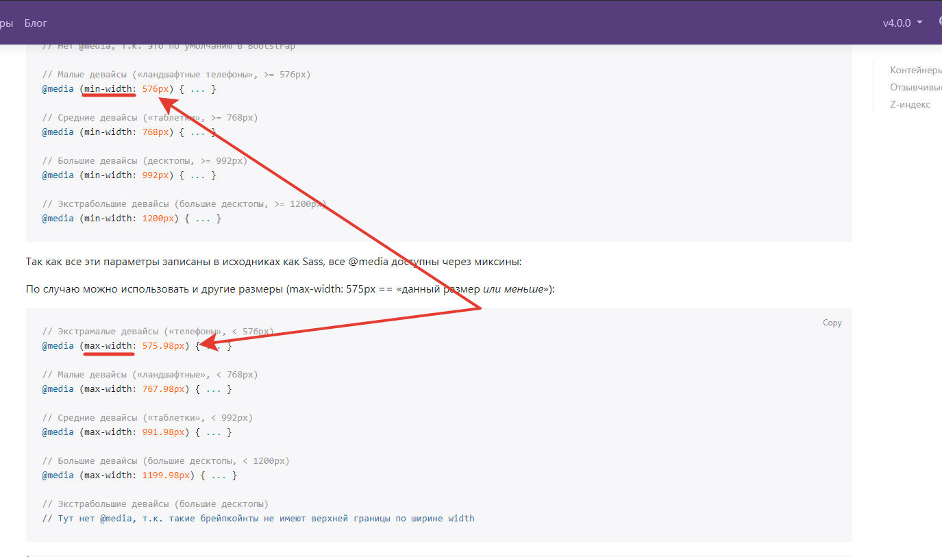
Why does bootstrap subtract 0.02px in media query?
Hello, having searched Google, I could not find an explanation for why the @include media-breakpoint-down(...)
admixture Subtracts 0.02px from the breakpoint and it is in queries where max-width is used that is some kind of optimization or what is it for? Here is an example from the documentation . Thanks in advance
Answer the question
In order to leave comments, you need to log in
So that there are no problems with inheritance, but the entire range is covered, including for fractional values.
Note that because browsers do not currently support range queries, we enforce min- and max- prefixes limits on prefixes and fractional-width viewports (which can happen under certain conditions on high-dpi devices, for example) using values with higher precision for these comparisons.
Didn't find what you were looking for?
Ask your questionAsk a Question
731 491 924 answers to any question