Answer the question
In order to leave comments, you need to log in
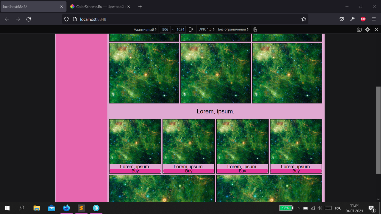
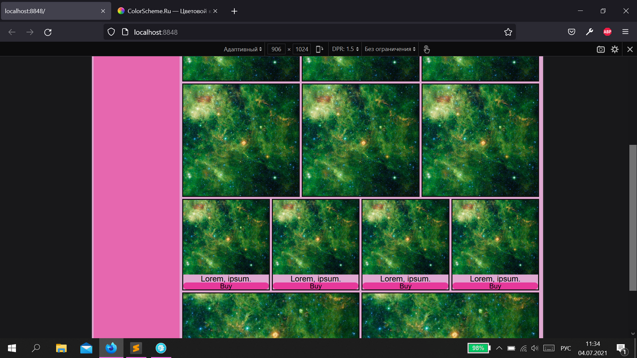
Why do photos expand and move onto the next block?


I made every img tag responsive with this code:
&__item {
flex: 1 1 auto;
position: relative;
margin: 2px
border: 2px solid #111;
padding: 100px
}
&__item img {
position: absolute;
top: 0;
left: 0;
object fit: cover;
height: 100%;
width: 100%
}
so it turns out that when you save the changes and refresh the page, the page looks "culturally" like in the first photo, but after waiting a bit or refreshing the page again, the photos from the first block seem to expand and drop into the second, thereby closing the heading (as you can see in the second photo).
how to eliminate this problem? I will be very grateful for any help.
Answer the question
In order to leave comments, you need to log in
As far as I can see, the pictures are not stretched. In variant 1 they are cut off, and in the second they are shown in full. Here you can try to change the properties of the image container (or the image itself - contain instead of cover), but without seeing the markup it is difficult to judge this accurately.
Didn't find what you were looking for?
Ask your questionAsk a Question
731 491 924 answers to any question