Answer the question
In order to leave comments, you need to log in
Why are the widths of the Bootstrap table header the same and the widths below are completely different?
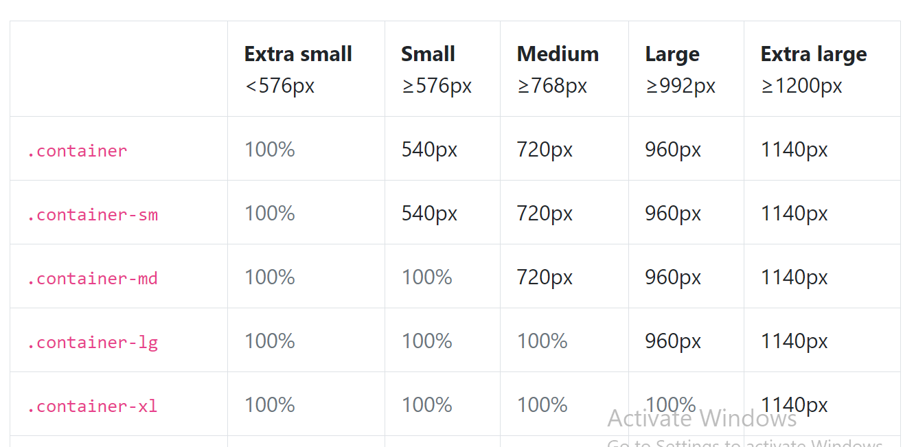
For example, medium in the header is 768px wide and opposite md is already 720px. And so everywhere. Why is that?
Answer the question
In order to leave comments, you need to log in
In the title breakpoint, and in the table the width of the container. The class containerand classes container-*, unlike the class container-fluid, have a fixed width. In your case, using medium as an example, this table shows that if the width of the device screen or browser window is equal to or greater than 768px, the width of the main site grid block (container) will be 720px. And if, for example, the site is viewed on a device with a screen of 800px, then there will be 40px of free space around the edges.
Didn't find what you were looking for?
Ask your questionAsk a Question
731 491 924 answers to any question