Answer the question
In order to leave comments, you need to log in
Which palette to use for Pantone Solid or CMYK typography?
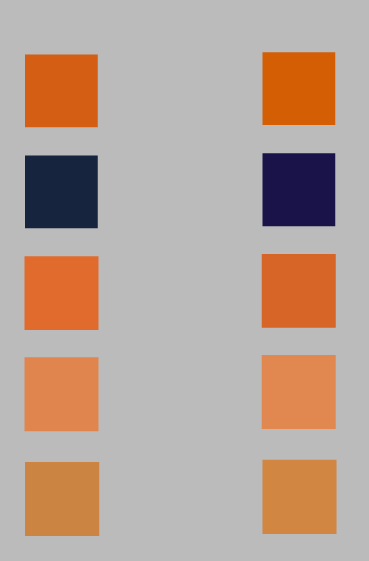
I can not understand why 2 palettes are so different from each other. Converted from Pantone solid to Pantone CMYK automatically in illustrator via "edit colors".
1. Is it normal that they are so different?
2. Do I need to convert from solid to cmyk in order to understand what color will be printed? Or is pantone color bridge better?
3. Can I use the same palette for digital as for print?
Answer the question
In order to leave comments, you need to log in
I can not understand why 2 palettes are so different from each other
Since there is a solution, I will answer the zero question. Let's consider this one as the zero question:
Answer: depending on what to print and in what circulation. For example, no one prints business cards in pantones in small print runs with us. Or if the client is not so hot what a corporation, then there is no point in bothering with pantones - such a print is not cheap.
The printing house needs CMYK, if you want some color (for example, some corporate one), you add pantone. But then the price of printing increases by about 30% for each pantone, since not 4 films and runs are made, but 4 + count. pantones.
If you add silver, bronze, etc., or a large company with your own pantone color, you need pantones. But not 100500 on the artboard, max 2-3
Didn't find what you were looking for?
Ask your questionAsk a Question
731 491 924 answers to any question