I
I
Integior2017-07-28 14:51:25
Design
Integior, 2017-07-28 14:51:25

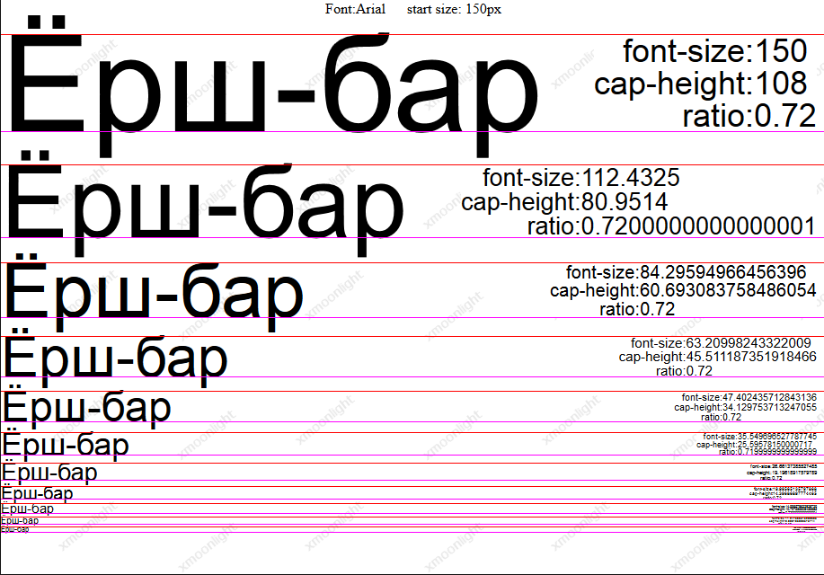
What to use when designing a site: a bounding box of text or an uppercase line and a baseline?

Suppose that the project will use an 8px grid, that is, we take 16px as the base and specify all distances and sizes (those that are fixed) in rem when layout:

  • padding-top: 1rem
  • margin-bottom: 0.5rem etc.

However, the question arises of how to work with text in design in this case:
  1. Consider the top and bottom margins of the bounding box of the text
  2. Treat the top and bottom margins as the cap line and baseline, respectively

With the first option, even distances are preserved during layout, however, the text does not lie on the baseline and the distances directly to the text itself will be larger (not the desired 8px, but 11px for example).
At the same time, the position of the text in the layout site will coincide with the position of the text in the design only if tools like sketch or figma are used, which draw the bounding box of text in much the same way as the browser, in Adobe Illustrator, if I'm not mistaken, the bounding box rendered differently.
In the second option, the text lies on the baseline, the distances are set directly to the text itself, but the layout is complicated:
  • The ability to specify distances to text in rem goes down the drain (well, unless you specify values ​​like 0.6875rem , which is somehow not very good) and you need to specify a specific value in pixels for each case
  • If you want to keep the ability to specify distances to text in rem, then you need to resort to all sorts of hacks (if the text spans several lines, with one line, for example, in buttons, there are no problems, just the line-height is corrected), such as using pseudo-elements that are assigned negative indents calculated from manually entered font metrics so that the top and bottom margins of text lie exactly on the capital and baselines. This, of course, complicates things greatly.

It is clear that if we are talking about single-line elements, then the second option is used, but I can’t decide which option is better if the text is multi-line, how is this problem usually solved?

Answer the question

In order to leave comments, you need to log in

1 answer(s)
X
xmoonlight, 2017-07-28
@Integior

2nd option and solved via font-ratio:
835149076ca840f5a155bd6c445cab57.png

Didn't find what you were looking for?

Ask your question

Ask a Question

731 491 924 answers to any question