Answer the question
In order to leave comments, you need to log in
What to change in the design of the site?
Evaluate my wine sale card layout for the site and tell me what details you should pay attention to in order to improve visual perception and usability.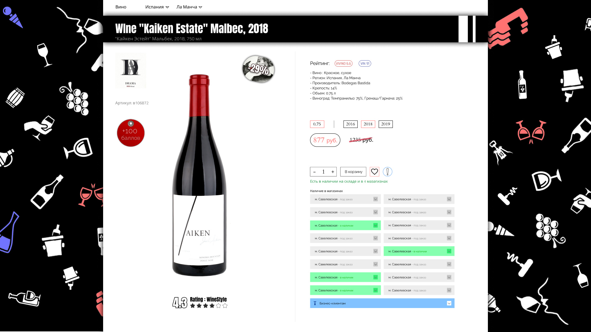
Answer the question
In order to leave comments, you need to log in
For visual perception, it is necessary to look at the final rendering of interface elements. The background is very heavy, and besides, h1 has merged with it. Clear the heading from filling, I would place it in the right block, above the main info.
As for convenience:
- Show only those points where it is available
- Show also the reverse side of the label
- Remove the stroke around the price, otherwise it seems that this is a button, although there is "Add to cart" below
- (probably it is, but on the screen no) Add below recommendations like "More Spain", "More Dry", "Similar but cheaper", etc.
- Group all three ratings into one block.
- If there are no reviews, then be sure to do it - in this area there are not enough stars, the description of sensations is much more important (see.
All this is subjective of course!
Didn't find what you were looking for?
Ask your questionAsk a Question
731 491 924 answers to any question