Answer the question
In order to leave comments, you need to log in
What is the best way to place a checkbox in a form?
Type of form, where the signature is on the left, and the input is on the right. How to place a checkbox in this form?
The options that I was able to highlight:
Option #1 : 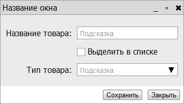
Used everywhere, including on the Google site. A significant disadvantage is that the checkbox seems to be contextually attached to the previous field , but this is not always the case.
Option number 2 : 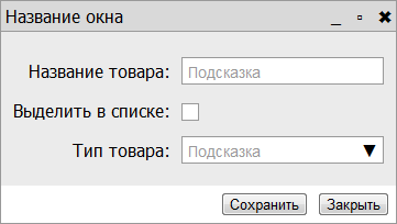
Looks neat and the move is quite logical. But the location of the signature on the left confuses me a lot.
Option number 3 : 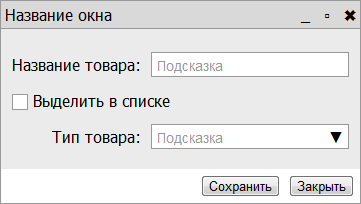
The grid is collapsing, therefore it looks dirty .
Option #4 : 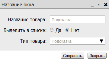
Everything is fine, but the interface becomes overloaded, instead of a laconic checkbox - two radios with signatures. Perhaps subjectively: I have an association with overloaded forms, thrown on Delphi, it was a rage in the 90s :)
Your advice is needed:
Which of the minuses can be neglected? Or are there other, uncompromising options?
P.S.
A spherical shape in a vacuum will be used everywhere in the interface, so it won't work to cheat and abolish the checkbox or replace it with something. You should not count on the fact that the checkbox will always be after the name (with a stretch, contextually suitable).
UPD:
I
looked through the forms from Lebedev's portfolio, found such an option, let it be option number 5 : 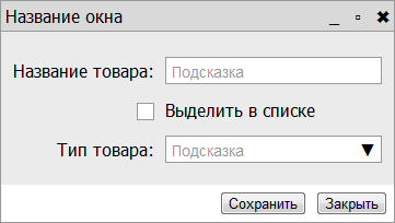
It seems to me that there is something in this, what do you say?
Answer the question
In order to leave comments, you need to log in
To summarize:
Firstly, I removed the colons, it became better, in addition, the second option began to be read normally.
Secondly, I think that the third option would look better if the captions were aligned to the left side.
Thirdly, if you use the first option, then you can put all checkboxes in one or more blocks and dress them with a horizontal line or other background, so they will not merge with the previous field. Although, in my opinion, this will make the form harder to perceive.
I settled on the 2nd option, without colons. I can not recommend this option, consider the question as a set of options.
Thanks to Riateche for the most informative and thoughtful answer.
More ideas fromtick . I don't think they're good, and explained why in the discussion of this answer, but the man tried, maybe you'll like them.
First option: the controls are on the same line, you can also place the selection last.

I usually use the first option. To prevent the checkbox from appearing related to the previous field, you need to increase the distance between the lines, or separate the lines from each other with horizontal lines.
The fourth option is no better than the second. Only the inscriptions "yes" and "no" make the situation even more like a question. The colon is clearly inappropriate here, it asks for a question mark: “Select in the list? Yes". In principle, the second and fourth options have the right to life, but from the point of view of the Russian language they look awkward (I don’t know what about other languages).
The third option, in my opinion, is the most unsuccessful.
It seems to me that the second option is optimal - the checkbox is clearly separated
You can visually “combine” the name of the product and the checkbox ... like this ... sorry for the clumsiness, photoshop under vine wanted to run.

Or you can move the checkbox to the button area on the left.
Is it possible to make the window wider and put the checkbox from option No. 1 in the line after the product selection droplist?
The first option or habrastorage.org/storage1/0fee0af0/233e4e5c/4c396de1/4301b69a.png
there are many more different forms for inspiration patterntap.com/tap/collection/8/1/90
I like option 4 and we try to use it in our projects.
Yes, it may look heavy, but it provides 100% user understanding.
Don't want this option?

i30.fastpic.ru/big/2011/1115/75/a3ca8e91d8094e93f3e09b9695759e75.jpg
Didn't find what you were looking for?
Ask your questionAsk a Question
731 491 924 answers to any question