Answer the question
In order to leave comments, you need to log in
What is the best way to output news items?
I'm making an information site, yesterday I started designing it. I ran into a problem, I don’t know how best to display news on the main page, I need advice from both experienced UX designers and ordinary users, just your opinion or professional advice.
I decided on the format 100%, it will be square blocks with a picture, but I don’t know how to do it better, there are 2 options.
First:
Here are pictures, when you hover over them, the background is darkened and the headline of the news appears. You can try the live version here https://bkhtn.ru/blocks/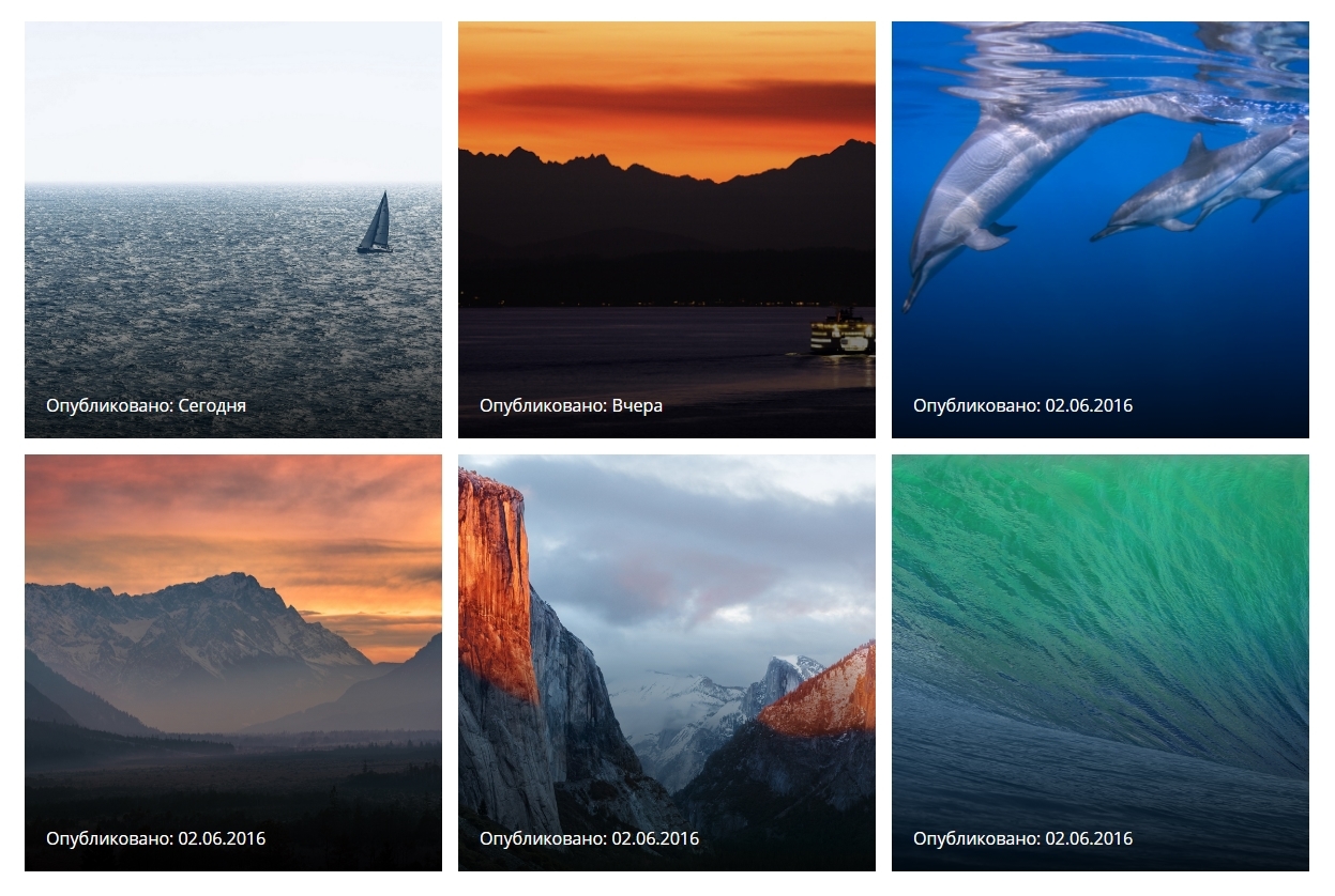
Second:
There are also pictures, but already darkened, and the title of the news is immediately visible, and when hovering over, the title is removed, and you can see the picture almost without darkening. Live version herehttps://bkhtn.ru/blocks/index2.html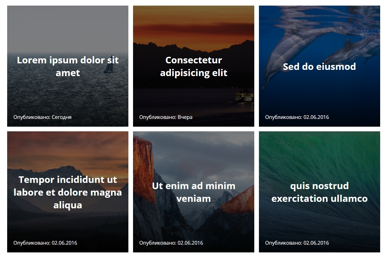
It seems to me that the second option is more useful, since the title is immediately visible and there is no need to do additional. actions to see it, but still I can not decide.
I'm waiting for advice :)
By the way, I forgot to mention that it was all done in a hurry and just to see how it would look, so on some browsers flex boxes / animations can fly off.
Answer the question
In order to leave comments, you need to log in
The first option is generally inoperable: on touch devices, :hover occurs only at the moment of tapa, i.e. visitors will not see the titles at all.
The second one is better, but not perfect. All blocks are the same, and if there is a lot of news, then the feed will look too uniform, too boring. Uniform feeds users scroll faster and read less because nothing to catch the eye.
It would be nice to make modules of different sizes (like tiles in Windows). Major news can be displayed in large size, less important ones can be displayed in small size. The page should have a hierarchy of information by importance and interest. With a heterogeneous feed structure, users scroll through the page more slowly, stop to look at large blocks and at the same time notice small ones around.
Hide the title of the news on hover is also not very good. If the visitor wants to view the picture, let them click on the news itself and view the picture inside.
I don’t know what your site will be about and what editorial policy is there, but you need to think about the design of the news without a picture.
And you also have a big problem - you design using stock images and lorem ipsum. This means that when filling the site with real content, dozens of problems will come out that you have not thought about:
- the title of the news is too long,
- the title of the news is too short,
- the title needs an explanation,
- the picture is too light - white on light is not contrasting,
- the picture too colorful - the background makes it difficult to read the text,
- the text covers the person's face in the photo,
- the news has no picture
, etc.
If you don't have your own news yet, take content from someone else's site and make a layout with real texts and pictures. This will expose possible future problems. The layout will not look as pretty, but the design will be more viable.
Related links:
artgorbunov.ru/bb/soviet/20160316
artgorbunov.ru/bb/soviet/20160127
artgorbunov.ru/bb/soviet/20160420
artgorbunov.ru/bb/soviet/20160427
Didn't find what you were looking for?
Ask your questionAsk a Question
731 491 924 answers to any question