Answer the question
In order to leave comments, you need to log in
What is the best way to lay out?
Hello, the question arose of how best to make a fairly simple one-page site.

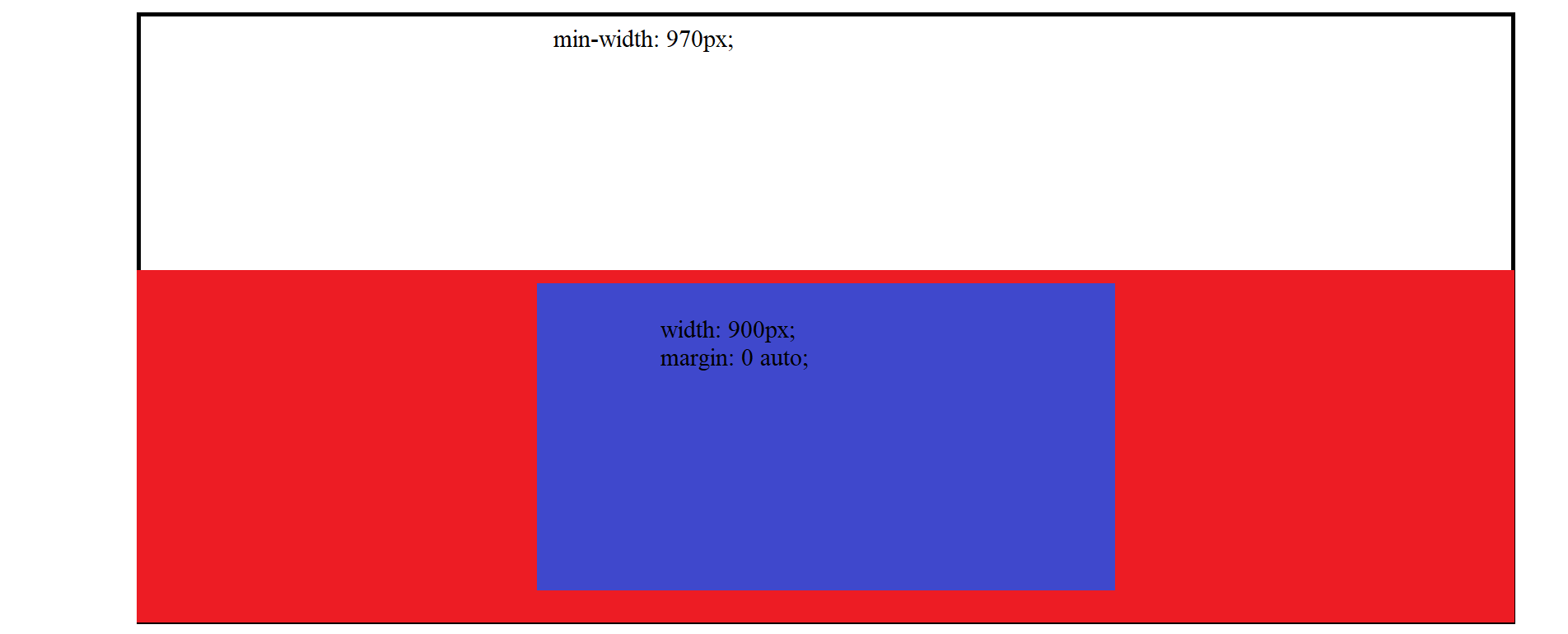
The red block is an svg image i.e. background under the blue block with absolute position, the blue block is some kind of content, it has the same width and height when the screen is stretched or reduced. The minimum width of the site at which scrolls are not needed is 970px, then let there be scrolls. The blue block must always be in the red block and must not go beyond the red block.
How to be with vertsk? If the width is more or less clear, then the height is not quite what to do? Write a bunch of media queries for any life situation? For example, there is a standard size of 1920x1080, everything is fine as it should, but when you decrease or increase the height, the blue block will go beyond the red one, how then to make up a bunch of media queries in this case?
Here is some css of the red and blue blocks:
Red:
width: 100vw;
height: 40vh;
position: relative;
&:after {
content: '';
position: absolute;
left: 0;
right: 0;
top: 0;
bottom: 0;
background: url('path.svg') no-repeat center;
background-size: cover;
}width: 900px;
margin: 0 auto;Answer the question
In order to leave comments, you need to log in
Didn't find what you were looking for?
Ask your questionAsk a Question
731 491 924 answers to any question