Answer the question
In order to leave comments, you need to log in
Answer the question
In order to leave comments, you need to log in
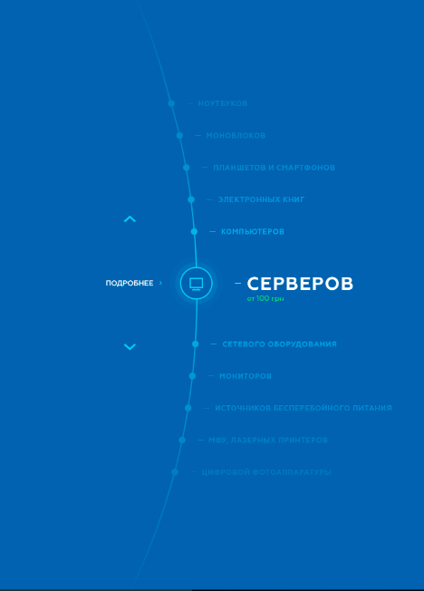
1. Large diameter circle - large div , large border-radius , thin border .
2. Menu items are absolutely positioned one on top of the other, then moved to the desired positions using transform: rotate (as in this example , only the corners are smaller).
3. The top and bottom shading is a linear gradient on top of it all, it's transparent in the center, visibly blue around the edges.
4. The central (active) menu element changes when it hits the center - the icon is enlarged from the point using transform: scale , and something like this is done around it .
5. Accordingly, it remains to fasten the js-logic: count the angles depending on the number of elements, rotate all this (when moving to a new menu item), add support for the keyboard (and apparently the mouse, so that the menu can be rotated with the wheel) and adaptability (on small screens, you can hide this beauty and leave the menu items in a column).
Didn't find what you were looking for?
Ask your questionAsk a Question
731 491 924 answers to any question