Answer the question
In order to leave comments, you need to log in
What is the best way to implement cards?
Hello, I'm not interested as a layout designer,
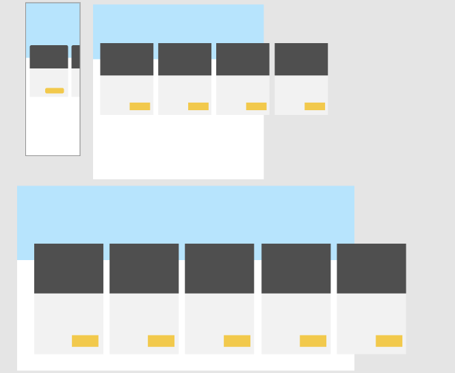
I need to implement 1 block with cards. There are 5-8 products that need to be made in the form of a slider:  .
.
With a smartphone and tablet, everything is clear. But what if there are, for example, 10, 18 or 30? How, then, should they look on a PC?
Are there any solutions besides the flow, like me in Yandex Pictures? 
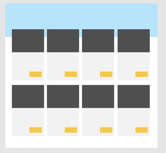
What could such a long slider on PC transform into? Would it conditionally be something like this? Example: 
Would it make sense, for this block, given that there are more than 5-9 cards, to do this? Example, from the Kulturvolk site, the slider is tied to the left: 
I will be glad to absorb any useful information on cards, the slider and typical problems.
Answer the question
In order to leave comments, you need to log in
I would leave them in one line (I would also leave them as a slider) and maybe make them horizontal if the width of the browser window exceeds 1200px.
That is, the light part with the yellow button would be placed on the right.
This would save us from the "palisade" and from the "blur" of attention from the simultaneous display of a large number of cards.
At the same time, this would immediately reduce the height of the slider by 2 times, which would allow you to see more of what is lower on the page without scrolling.
It is incorrect to load 30 cards at once, which will be in the slider, and the volume is too large for scrolling, no one will scroll to the 30th card in the slider, where only 5 products are initially visible.
There are several options:
1. The "show more" button - when pressed, 6 more cards will appear with a smooth animation. Then on the PC it will not be necessary to implement the slider at all.
2. The "show all" button, which leads to a complete list of all cards.
Didn't find what you were looking for?
Ask your questionAsk a Question
731 491 924 answers to any question