Answer the question
In order to leave comments, you need to log in
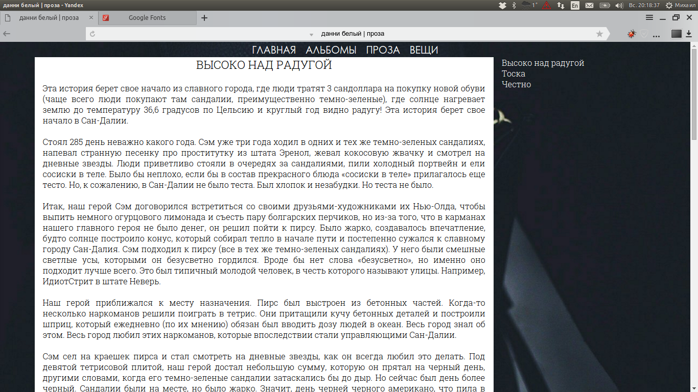
What is the best way to arrange a mini-menu?

I am writing a website for a writer. As planned, there is a bar on the right, and works on the left. And depending on the selected work on the right, the content on the left changes. Can you tell me how to make this look better?
Maybe you have seen a similar feature?
From the point of view of the code, everything is implemented, the question is in the design.
https://www.dropbox.com/s/xphf9zaskxxpgja/1.mkv?dl=0 - here is a video for better understanding
Answer the question
In order to leave comments, you need to log in
Are you making a website for money? Looking for a designer. For money. Do it "on enthusiasm", look for someone from your circle of friends who can help you for free.
Didn't find what you were looking for?
Ask your questionAsk a Question
731 491 924 answers to any question