Answer the question
In order to leave comments, you need to log in
What is the best interface for the game?
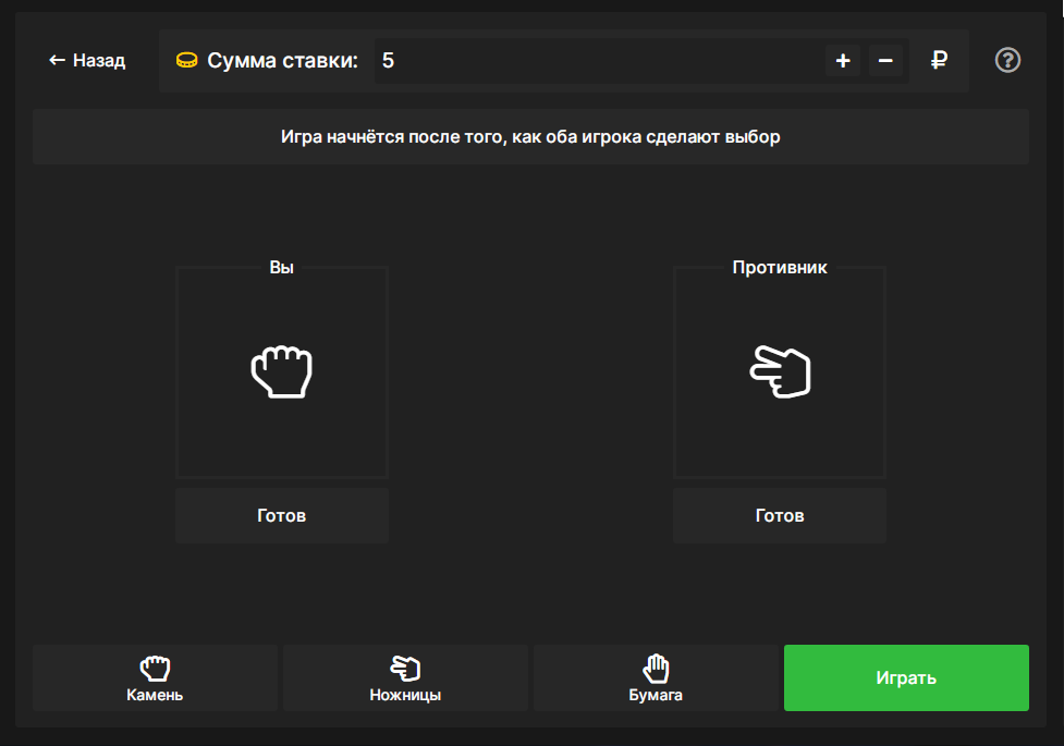
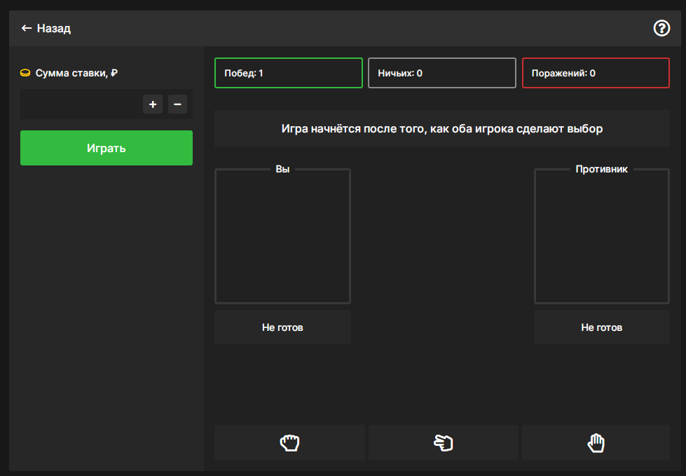
Hello , in general, I made two interfaces for playing stone, scissors, paper,
but I can’t decide which one is better, can you tell me which option you liked best and do you understand
where you need to click?
PS If you have any ideas how to improve the interface please tell me please.


Answer the question
In order to leave comments, you need to log in
The first option seems more practical to me. In the second one, the sidebar takes up a lot of space, although you can only place a bet there. And in the first just more emphasis on the game. The only thing missing is a more detailed rendering of the icons of stone, scissors and paper. The interface itself is minimalistic and those minimalistic icons get lost in the overall interface. I would make them different, not contour ones, maybe even take them from iPhone emoji, as an option.
Didn't find what you were looking for?
Ask your questionAsk a Question
731 491 924 answers to any question