Answer the question
In order to leave comments, you need to log in
What is a grid and what is it with?
Good day, colleagues!
Often in cases I see a grid of this kind. As I understand it, the principle of building a grid is due to the "adding" of a part of the screen, depending on its size. For example, if the screen is 1360 pixels, then all layout elements outside the container are cut off.
Tell me where you can read more about it. Perhaps there is a video of master classes that shows working with a grid using an example. Thank you! 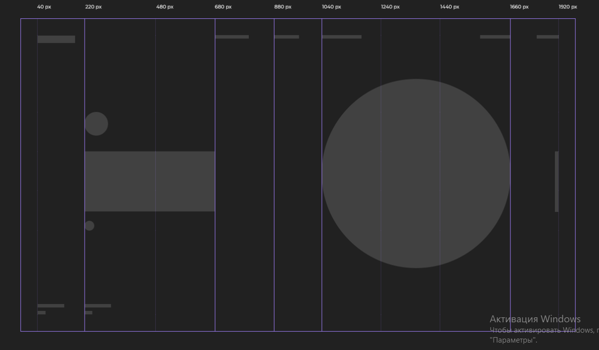
I tried to figure it out on my own - at random. Nothing good comes of this.
Answer the question
In order to leave comments, you need to log in
Grid layout came to the web from print design. Look at newspapers - all self-respecting publications are laid out using a grid. Logos, images, text are arranged in columns. The main thing in the grid is the concept of a column (rows are rarely used), there can be as many as you like, the most popular are 12 and 24 columns. Because these numbers have the largest number of divisors. Why is this needed? One column is a unit of account. Look at the layout (12 columns) - the logo is 2 columns, the slider text is 4 columns, the slider image is 6 columns, each block in the services section is 4 columns. And so on ... That is, 12 is easily divisible by 1, 2, 3, 4, 6, 12. Separates the columns of the so-called. gutter (English - gutter).
This approach allows the layout of blocks on the page, convenient for visual perception, as well as re-arrangement of blocks, if adaptive layout is being done. That is, the total number of columns is preserved, only a different number of columns can already occupy each block, or even disappear on some screen.
Eat it mostly using MediaQueries (Media Queries or Media Expressions) which are part of the Css specification, like this:
`@media (min-width: 768px) { /* Your CSS code block */ }, where
`@media - @-rule,
(min-width: 768px) - a media function that defines a condition (conditions, if there are several), under which the rules described in the body of the media expression will be applied.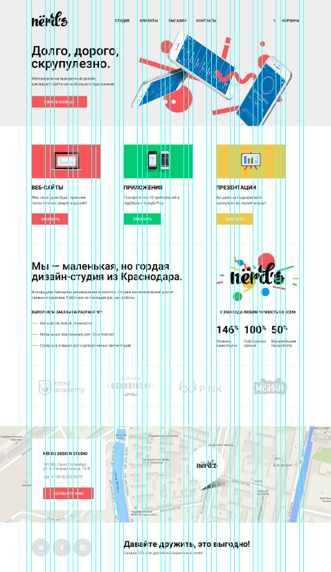
If you google on this topic, then:
When using a grid, it turns out, firstly, to arrange the elements into a "system", which in capable hands gives a "composition" / order, and, secondly, such a layout will then be easier to typeset using frameworks.
Get started with one of the pioneering grids for " 960 px ".
Here is also an example of an explanation on this topic.
- This, by the way, is not entirely true. In a "normal" mesh, nothing is clipped. Rather, it changes according to pre-foreseen scenarios. Roughly speaking (very roughly) you have several layouts for small, large, medium window sizes. And the grid allows you to maintain rhythm and order in all this.
Didn't find what you were looking for?
Ask your questionAsk a Question
731 491 924 answers to any question